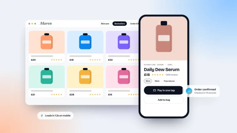
eCommerce Website Design Essentials That Drive Sales
Shoppers decide in seconds whether your shop feels fast, trustworthy and easy to buy from. Here’s what to get right.

September 2026
By The Qivox team
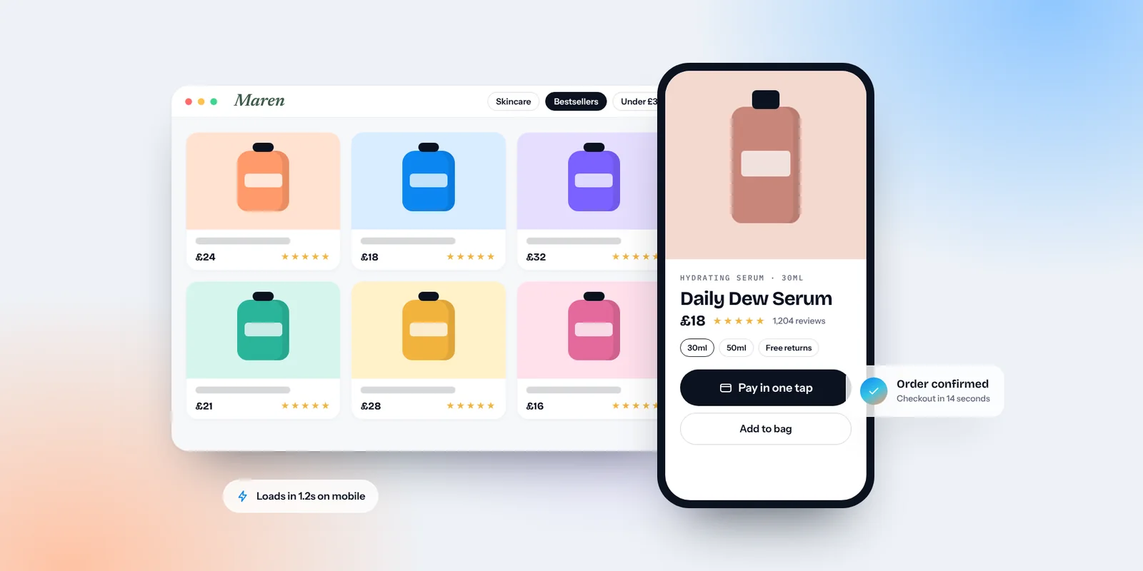
Shoppers arrive at an online shop from everywhere: a social post, a search result, a friend’s message, an AI assistant’s recommendation. Wherever they land, often on a product page rather than your homepage, they decide within moments whether your shop feels fast, trustworthy and easy to buy from. Good ecommerce website design isn’t about decoration. It’s about removing every small doubt between “that looks nice” and “order confirmed”. These are the essentials we focus on, with a check you can run on your own shop for each one.
Ecommerce website design starts on the phone
For most small shops, the majority of visits now come from phones, so design and test there first. Product photos should fill the width of the screen and swipe easily. The price, key options and the add-to-basket button should all be visible without much scrolling. Once a shopper scrolls past the button, a slim sticky bar with the price and “Add to basket” keeps it within reach of their thumb. Make sure size and colour selectors are large enough to tap accurately. Our guide to designing for thumbs covers tap targets and spacing in more detail.
Check it today: pick your best-selling product, open it on your phone and try to add it to your basket with one hand. Note every moment you hesitate.
Help people find the right product
If a shopper can’t find a product, they can’t buy it. Navigation, search and filters do this work, and they matter more the larger your range.
Shop categories people recognise: Name categories the way customers describe products, not the way your stock system does. “Gifts under £30” beats “Collection 4”.
Search that forgives: Search should handle spelling mistakes, plurals and common alternative names, and suggest products as people type.
Filters that match real decisions: Size, colour, price and availability cover most shops. Add filters for whatever your customers actually choose by, such as dietary needs, materials or occasion.
Never a dead end: If a search finds nothing, show popular products or related categories rather than an empty page.
Product pages that answer every question
A product page has to do the job a helpful shop assistant would do in person. Every unanswered question is a reason to leave and look elsewhere.
Photos from every angle: Show the product in use, in context and close up. Real photos that match across your range build trust, as we explain in your website photos do half the talking. A short video helps for anything that moves, folds or fits.
Sizing and dimensions: Give measurements in plain numbers and, for clothing, a clear size guide. Show the product next to something familiar for scale.
Delivery and returns up front: Delivery cost, delivery time and your returns policy should sit near the add-to-basket button, not hidden in the footer.
Honest descriptions: Lead with what the product does for the buyer, then the details: materials, care, ingredients, what’s in the box.
Clear stock status: Say plainly whether an item is in stock, low in stock or available to pre-order.
Speed you can feel
A slow shop loses people before they see a single product. Google measures real-world experience through its Core Web Vitals, which are worth knowing in plain terms.
Loading (LCP): How quickly the main content appears. Google treats 2.5 seconds or less as good.
Responsiveness (INP): How quickly the page reacts when someone taps a button or picks a size. It replaced an older measure in 2024, and 200 milliseconds or less counts as good.
Visual stability (CLS): Whether things jump around as the page loads. A button that moves just as someone taps it causes mis-taps and frustration.
Usual culprits: Oversized images, too many apps or plugins, and heavy pop-ups. Compress images, remove apps you don’t use and test again.
Check it today: run a product page through Google’s free PageSpeed Insights and look at the mobile results first.
A checkout with no surprises
The checkout is where small frustrations cost the most. Unexpected costs are one of the most commonly reported reasons people abandon a basket, so show the full price, including delivery, before the final step. Offer guest checkout, because many shoppers don’t want to create an account to buy one thing. Support the payment methods people already use on their phones, such as Apple Pay, Google Pay and PayPal, so they can pay without typing card details. Keep forms short, use clear error messages next to the field, and make the final button say exactly what it does, such as “Pay £42.50”. Our note on one primary button per page explains why clear labels matter.
Show the full cost before the final step. A surprise at checkout undoes everything the product page achieved.
Accessible shops sell to more people
Accessibility makes a shop easier for everyone: clear text, good colour contrast, labelled form fields, keyboard-friendly menus and descriptive alt text on product images. It also matters legally. The European Accessibility Act has applied since June 2025 and covers many online shops selling to consumers in the EU, including some UK businesses that sell there, with an exemption for the smallest service businesses. If you sell into the EU, it’s worth checking whether it applies to you. Either way, building to the WCAG guidelines is a sensible standard.
Build a shop that’s easy to buy from
Start with the checks above on your best-selling product and fix the biggest problem first. If you’re planning a new shop or a rebuild, our eCommerce websites service designs every step around the shopper, from first landing to order confirmation.
Want to know where your shop is losing people? Ask for a free website review and we’ll walk through your product pages and checkout.