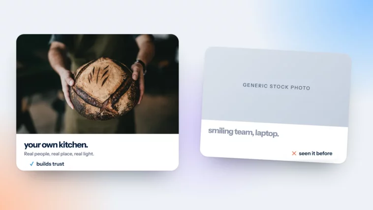
Your Website Photos Do Half the Talking
Generic stock says “any business”. Real photos say “this one”. A simple brief to get there on any budget.

October 2026
By The Qivox team

Before anyone reads your headline, they’ve already seen your pictures. A photo is the fastest thing on a page to take in, and it quietly answers questions words can’t: what does this place look like, who will I deal with, is it the kind of business I want. That’s why your website photos do half the talking. Get them right and the rest of the page has an easier job. Get them wrong and even good copy has to work against the image above it.
Stock says “any business”
You know the pictures. The handshake across a desk. The smiling person in a headset. The laptop on a spotless white table next to a single succulent. Your customers have seen them a thousand times, on a thousand other websites, and they’ve learned to skip past them.
The problem isn’t that stock photography is badly made. Much of it is beautiful. The problem is that it could belong to anyone. A dental practice using a stock photo of a smiling patient tells visitors nothing about that practice. A real photo of the actual waiting room, the actual chair, the actual team tells them a lot. If you’re curious, run your current hero image through a reverse image search such as Google Lens. If it turns up on other businesses’ websites, your visitors may have seen it there too.
Real photos say “this one”. They show the place, the people and the work your customers will actually get.
A five-line photo brief
Whether you’re hiring a photographer or using your own phone, write a short brief first. It keeps every picture pulling in the same direction.
Real people, real hands: Your team at work, your hands shaping the product, your customers using it. Photograph customers only with their permission, and keep a simple record that they agreed.
Daylight wherever possible: Natural light flatters people, food and products. Shoot near a window or outside, and switch off overhead lights that tint everything yellow.
One consistent edit: Pick one look, warm or cool, bright or moody, and apply it to every photo. Filter-hopping makes a site feel stitched together.
Space left for text: Shoot some images with clear areas of wall, sky or table, so a headline can sit on top without a fight.
Show the result: Process shots are interesting, but people buy outcomes. Show the finished cake, the repaired roof, the happy client leaving.
No budget? A phone, a window and the same edit
A modern phone is more than good enough for a small business website if you’re consistent. Consistency beats expensive equipment every time. Here’s a method that works.
Clean the lens: It sounds obvious, but a smudged lens is the most common reason phone photos look hazy.
Use the same window, same time: Morning light from a side window is soft and even. Use the same spot and time of day for each session so the photos match.
Keep the same angle: Choose one or two angles, straight on or from above, and repeat them. Turn on your camera’s grid to keep lines level.
Shoot both ways: Take every important shot in landscape and portrait. Websites need wide images on desktop and taller crops on mobile.
Skip digital zoom: Move closer instead. Zooming on most phones throws away detail you’ll want later.
Save one preset: Edit one photo until you love it, save the settings as a preset and apply it to the rest.
Get your website photos ready for the page
A great photo can still let you down if it’s uploaded straight from the phone. Large files slow pages down, especially on mobile data, and slow pages lose visitors. Before uploading, resize each image to roughly the largest size it will be displayed at, then compress it with a free tool. Modern formats such as WebP usually give smaller files than JPEG at similar quality, and most website platforms now accept them.
Give each file a descriptive name, like bakery-sourdough-loaves.jpg rather than IMG_4821.jpg, and write short alt text that describes what the photo shows. Alt text helps people using screen readers and helps search engines understand the page. If you put text over a photo, add a tinted overlay so it stays readable. Our guide to colour contrast explains why that matters.
Common mistakes, and where to start
Mixing real and stock: One glossy stock image next to honest phone photos makes both look worse. Choose one approach per page.
Using photos of people without asking: Identifiable people are personal data. Ask first, and be ready to remove a photo if someone changes their mind.
Burying the best photo: Your strongest picture belongs at the top of the homepage, not halfway down the gallery.
Using stock for the wrong job: Stock is fine for textures, backgrounds and abstract details. It’s weakest when it pretends to be your team or your premises.
Start with the first image on your homepage. It does the most work, because every visitor sees it, and it sits right next to your homepage headline. Swap that one photo this week. Then move on to your About page and your most visited service page.
Make photography part of your brand
A consistent photo style is part of your identity, just like your colours and typefaces. That’s why our brand identity work often includes a short photo direction, so everything you shoot afterwards feels like it belongs. When we build a site through our website design and development service, we plan layouts around the photos you actually have, not the ones a template assumes.
Wondering whether your images are helping or hurting? Ask for a free website review and we’ll tell you what your photos are saying.

