Light Grey Text Is Costing You: A Plain Guide to Colour Contrast
Pale text looks elegant in the mockup. On a phone, in sunlight, nobody can read it.

October 2026
By The Qivox team
Pale grey text on a white background is one of the most common things we see on small business websites. It looks calm and refined on a large, bright monitor in a design studio. Then a customer opens the same page on their phone, at a bus stop, with the screen brightness turned down to save battery, and the words fade into the background. Good colour contrast is the difference between text people read and text they skip. This guide explains the numbers in plain English, shows you how to check your own site in seconds, and gives you three fixes.
Why light grey creeps in
Nobody sets out to make their website hard to read. Light grey usually arrives for good reasons. A designer wants the main heading to stand out, so the body text is made softer. A template ships with pale grey as its default. A brand colour that works beautifully in a logo is reused for small text, where it’s far too light.
The trouble is that the people choosing these colours often see them in ideal conditions: a calibrated screen, indoor light, perfect eyesight and full brightness. Your customers don’t. They read on older phones, in sunlight, with tired eyes or with reading glasses left at home. Low contrast affects everyone in those moments, not only people with low vision.
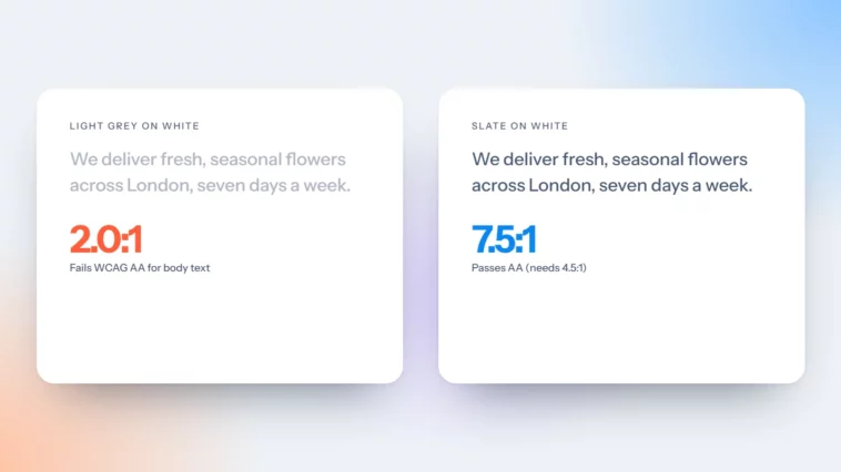
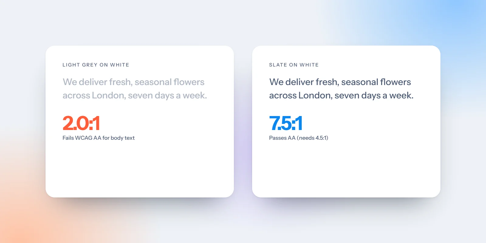
Same words, same size. Grey #B5BBC5 on white scores about 1.9:1 and fails. Grey #4A5566 scores about 7.5:1 and passes.
The colour contrast numbers that matter
Contrast is measured as a ratio between two colours, from 1:1 (identical) to 21:1 (black on white). The Web Content Accessibility Guidelines, known as WCAG, set the targets most designers and many organisations work to.
4.5:1 for body text: The minimum at level AA for normal-sized text, including paragraphs, menu links, captions and form labels.
3:1 for large text: Large means roughly 24px and above, or about 19px and above in bold. Headings usually fall into this group.
3:1 for buttons and controls: The edges of buttons, form fields and icons people need to understand should stand out from what surrounds them by at least 3:1.
7:1 if you want to go further: Level AAA asks for 7:1 for body text. It isn’t required for most sites, but it’s a nice target for long reading.
What’s exempt: Logos and purely decorative text don’t need to meet the ratios, and neither do disabled buttons. Everything people need to read does.
Check your site in ten seconds
You don’t need special software. Free contrast checkers, such as the one from WebAIM, let you paste in two colour codes and give you a pass or fail straight away. Browser developer tools in Chrome and Firefox will also show the contrast ratio when you inspect a piece of text.
Find your colours: Ask your web designer for the colour codes, or use a free colour picker browser extension to grab them from the page.
Test your body text first: This is the text people read most. Check it against your main background colour.
Then test your buttons: Check the label text against the button colour, and the button against the page behind it.
Do the sunlight test: Open your site on your phone, outside, at half brightness. Anything you squint at needs fixing, whatever the checker says.
Three quick fixes for light grey text
Darken your grey until it passes: On a white background, #767676 is about the lightest grey that reaches 4.5:1. A common grey such as #999999 scores only about 2.9:1. Darker greys still look soft and still pass.
Add an overlay behind text on photos: Text over a busy image will fail somewhere, even if it passes elsewhere. Put a dark tint or a solid panel behind it, and check against the lightest part of the image. Our guide to website photos covers shooting images with space for text.
Check buttons, not just paragraphs: White text on a mid-blue or bright orange button often falls short. Darken the button slightly, or make the label bold and larger. See one primary button per page for more on making your main button stand out.
If a brand colour is too light for text, don’t abandon it. Use it for backgrounds, borders, icons and large shapes, and choose a darker shade from the same family for words. A good brand palette plans for this from the start, which is one reason our brand identity work includes tested text and background pairings.
Places low contrast hides
Once your main text passes, look in the corners of your site. These are the spots we most often find quietly failing: placeholder text inside form fields, which many people mistake for an answer already filled in; links within paragraphs that differ from the surrounding text by colour alone; footer text, which is often the palest on the page; cookie banners and pop-ups added later by a plugin; and small print under prices, such as delivery costs or VAT notes, which is exactly the information people need to trust you. Fix these and your whole site becomes easier to use.
Readable is beautiful
Good contrast doesn’t make a site look heavy or clinical. It makes it feel confident. When we design through our website design and development service, we check every text colour, button and form field against the guidelines before launch, so readability is built in rather than patched afterwards.
Not sure how your site measures up? Ask for a free website review and we’ll flag any text, buttons or forms that are hard to read.