Journal: Website, Email & Brand Design Notes
Journal · Design notes

the journal.

Plain, practical notes on websites, email design and branding for small businesses. One idea per article, something you can act on today.

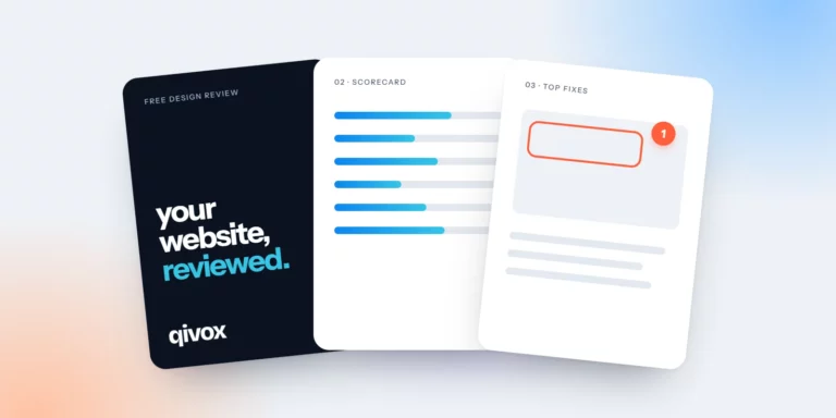
Three pages of a free design review: cover, scorecard and annotated fixes
Studio · 4 min readInside a Free Design Review: What You Get and How It Works

Seven pages, a scorecard and your top five fixes. Here is exactly what is inside a free design review, and how to get the most from it.
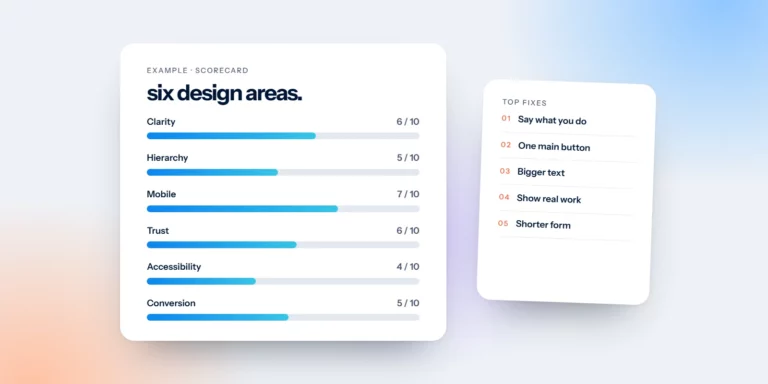
An example design review scorecard across six design areas, with top fixes
Website · 4 min readWhat We Look at in a Website Review

Hierarchy, calls to action, layout, user experience, brand and mobile. The six areas we score in every website review, and why each one matters.
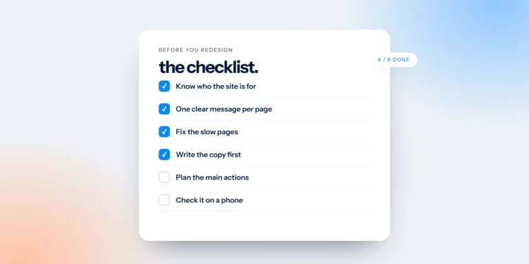
A website redesign checklist with four of six items ticked
Website · 4 min readThe Website Redesign Checklist: Fix These Before You Start

Before you pay for a new website, try these five fixes. Some take an hour. If the site still isn’t working afterwards, here’s what to prepare.
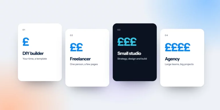
Four website options from DIY builder to agency, shown with one to four pound signs
Business · 4 min readHow Much Does a Small Business Website Cost in the UK? (2026 Guide)

From a DIY builder to a London agency, what small business websites typically cost in the UK, what drives the price and how to compare quotes fairly.
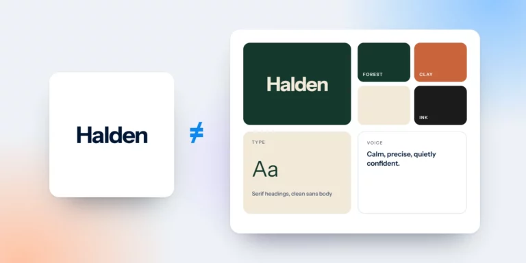
A logo on its own compared with a full brand board of colour, type and voice
Branding · 5 min readA Logo Is Not a Brand: What a Brand Identity Really Includes

A logo is a signature. A brand is a reputation. Here is what a brand identity really includes, and how to check yours this week.
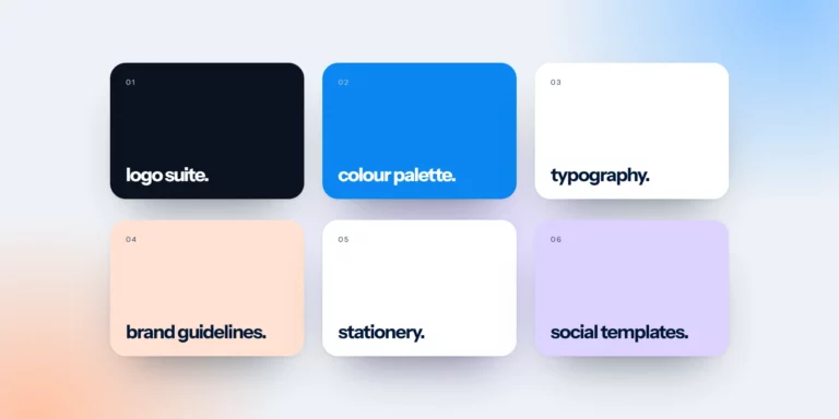
Six parts of a brand identity package: logo suite, colour palette, typography, guidelines, stationery and social templates
Branding · 4 min readWhat’s Included in a Brand Identity Package?

If your designer hands you one PNG and calls it a brand, something is missing. Here is what a brand identity package should include.
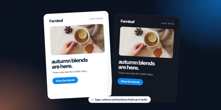
The same email design in light mode and dark mode
Email design · 5 min readHow to Design Emails for Dark Mode

Many subscribers read email in dark mode. Here’s how to keep your logo visible, your text readable and your buttons looking like buttons, whatever the inbox does.
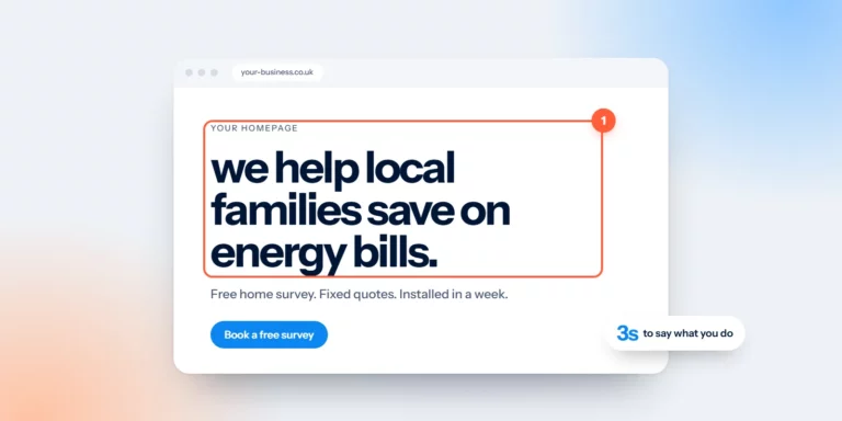
A homepage with a large, clear headline circled, and a note: three seconds to say what you do
Website · 5 min readYour Homepage Headline Has Three Seconds

A stranger should be able to read your homepage headline and say what you do, who it’s for and where. Here’s a formula and a test.
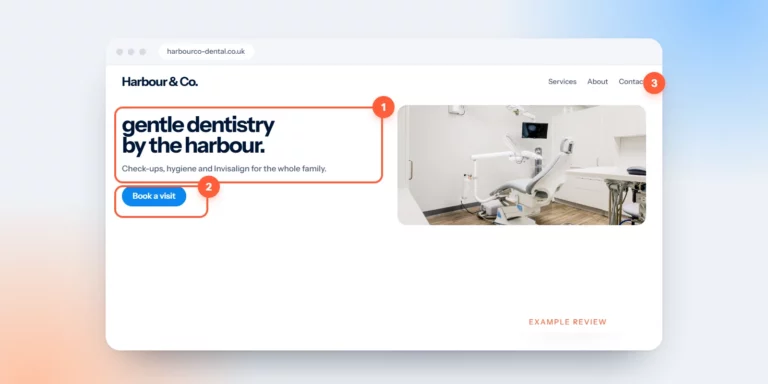
An example dental practice homepage annotated with review notes
Website · 4 min readWebsite Review Example: A Dental Practice Homepage

We reviewed the homepage of an imaginary dental practice. Every problem on it is one we see on real sites, and so is every fix.
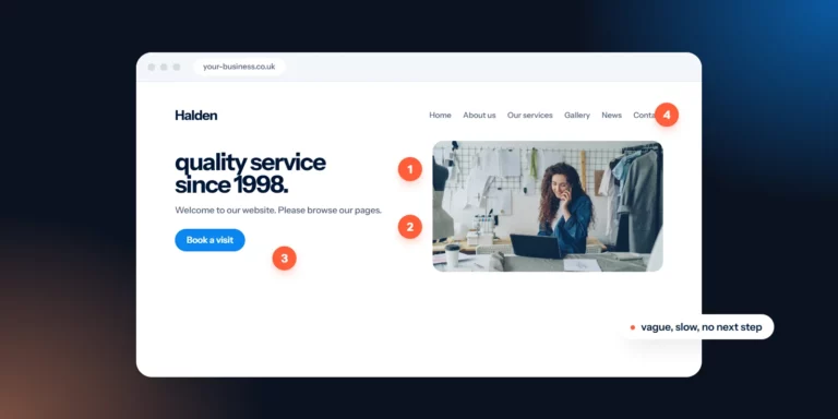
A vague homepage marked with numbered problem points
Website · 4 min read7 Signs Your Website Is Losing You Customers

Slow pages, unclear buttons, stale news and hidden prices. Seven signs your website is turning people away, and what to do about each.
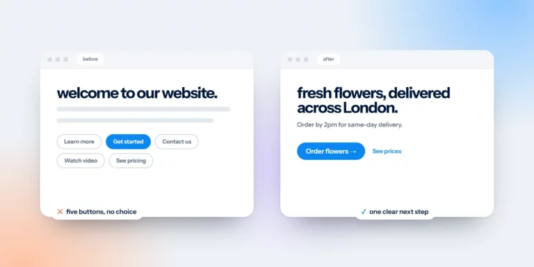
Two web pages compared: five competing buttons versus one clear main button
Website · 4 min readOne Primary Button Per Page: Why Fewer Choices Win

Two buttons with equal weight ask visitors to make a decision they didn’t come to make. Pick one primary button, label the outcome and repeat it.
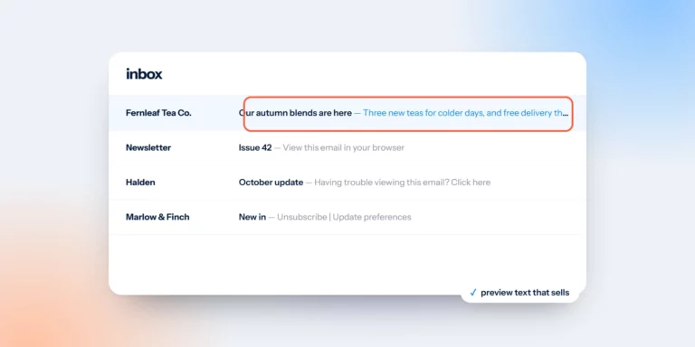
An email inbox with one message whose preview text is highlighted
Email design · 5 min readEmail Preview Text Is Your Second Subject Line

The grey line next to your subject is a second chance to earn the open. Four rules, a before and after, and the template details that stop it going to waste.
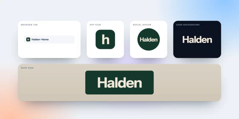
One logo tested in a browser tab, app icon, social avatar, dark background and shop sign
Branding · 4 min readTest Your Logo in Five Places Before You Approve It

A logo that looks perfect on a white screen can fail in an avatar, on a photo or at 16 pixels. Five quick tests to run before you approve it.
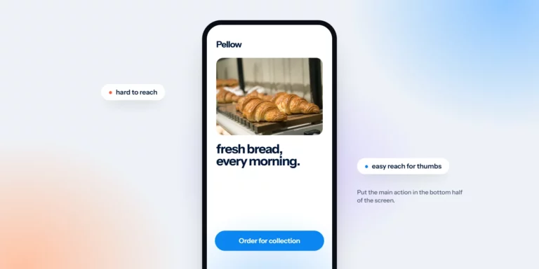
A phone screen with the main button in the easy thumb zone at the bottom
Website · 4 min readDesign for Thumbs: Mobile Website Tips for Small Businesses

Most people browse with one hand. Five practical mobile website tips, and a quick test: can you book, buy or call with one hand, standing on a bus?
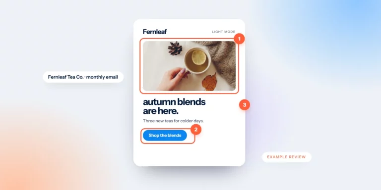
An example tea shop newsletter annotated with review notes
Email design · 4 min readNewsletter Review Example: A Tea Shop’s Monthly Email

We mark up an invented tea shop’s newsletter: an offer hidden in a photo, four paragraphs before anything to click, and a lonely “click here”. Then we fix it.
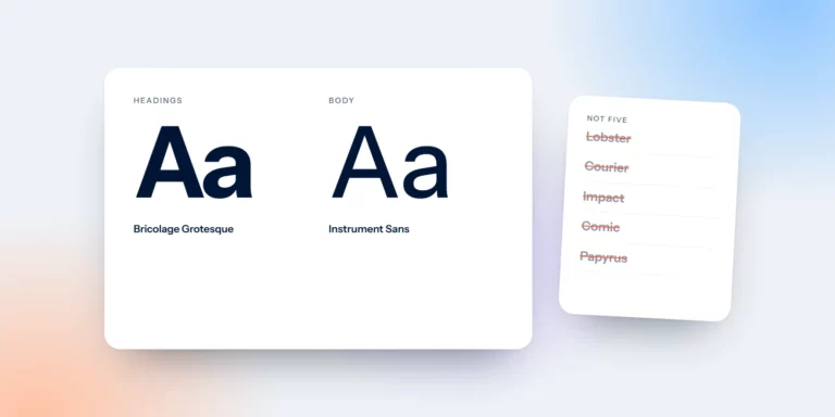
Two typefaces, one for headings and one for body text, with five extra fonts crossed out
Branding · 4 min readTwo Typefaces Are Enough: Choosing Fonts for Your Brand

Most brands need two typefaces: one with personality for headlines, one built to be read. Here is how to choose and pair them.
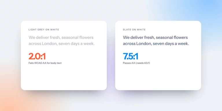
Light grey text failing contrast next to darker slate text passing WCAG AA
Website · 4 min readLight Grey Text Is Costing You: A Plain Guide to Colour Contrast

Light grey text looks elegant in a mockup and disappears on a phone in sunlight. The contrast numbers that matter, and three quick fixes.
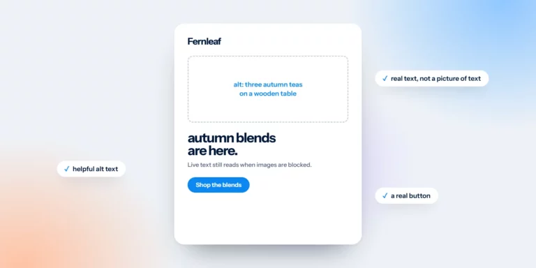
An email with images turned off, still readable thanks to live text and alt text
Email design · 4 min readDesign Emails That Still Work With Images Off

An email made of one big image becomes a blank box when images don’t load. Four design habits that keep your message readable either way.
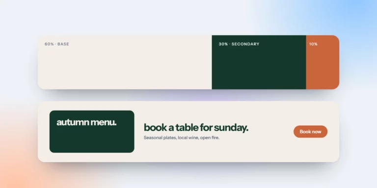
A 60-30-10 colour split applied to a simple restaurant web banner
Branding · 4 min readThe 60-30-10 Colour Rule for Brands and Websites

Sixty per cent dominant, thirty secondary, ten accent. A simple colour rule that keeps brands and websites calm, clear and easy to act on.
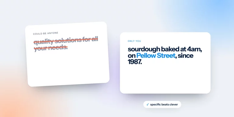
Generic website copy crossed out next to specific copy that only one business could write
Branding · 4 min readSay What Only You Can Say: Writing Website Copy That Stands Out

“Quality service you can trust” could belong to anyone. A simple recipe for taglines and website copy that only your business could say.
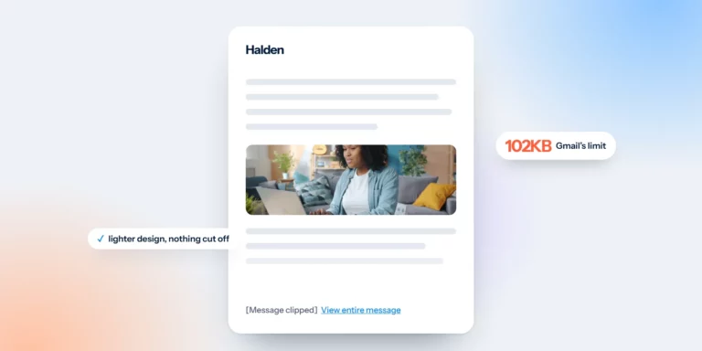
An email cut off by Gmail with a View entire message link and a 102KB label
Email design · 4 min readWhy Gmail Clips Your Emails, and How Design Can Avoid It

Gmail hides the end of emails over about 102KB. What gets lost, why it matters, and the design decisions that keep your campaigns light.
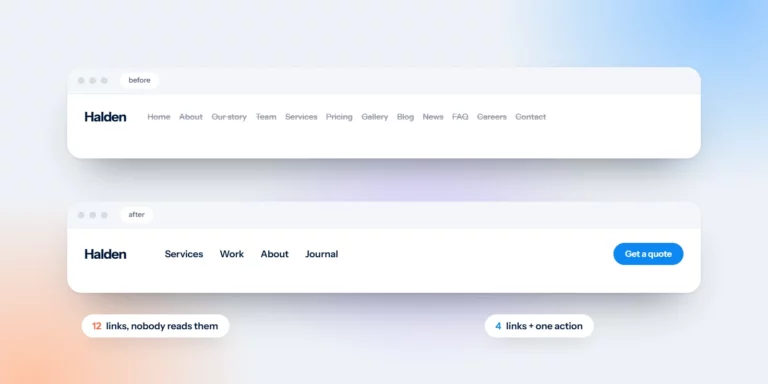
A cluttered twelve-link menu compared with a simple four-link menu and one button
Website · 4 min readYour Menu Is Not a Sitemap: Simple Website Navigation

Your menu doesn’t need to list every page. Four rules for simple website navigation, with a before and after you can copy.
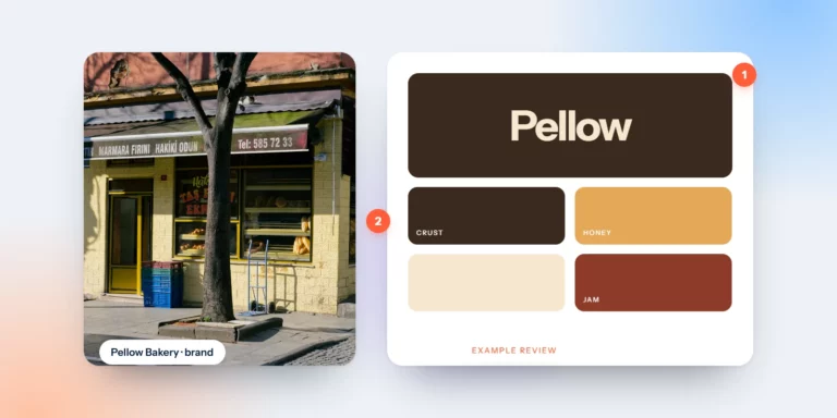
An example bakery brand board annotated with review notes
Branding · 4 min readBrand Review Example: A Neighbourhood Bakery

Great bread, a long story and four different brands. We review an invented bakery to show how a brand review works, step by step.
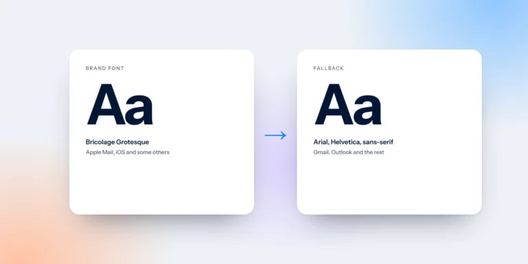
A brand font in email next to its Arial fallback
Email design · 4 min readFonts in Email Design: What Works in Every Inbox

Custom fonts only show in some inboxes. Everyone else sees a fallback, so choose it on purpose. Safe fonts, the Outlook trap and type that reads well on a phone.
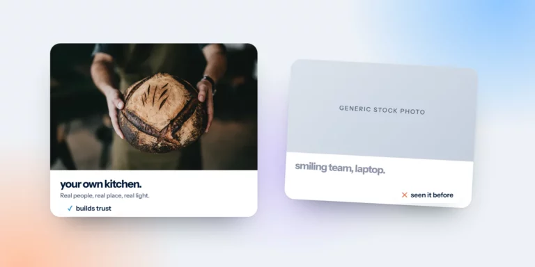
A real bakery photo compared with a generic stock photo
Website · 4 min readYour Website Photos Do Half the Talking

Stock photos say “any business”. Real photos say “this one”. A five-line brief and a phone-and-window method you can use this week.
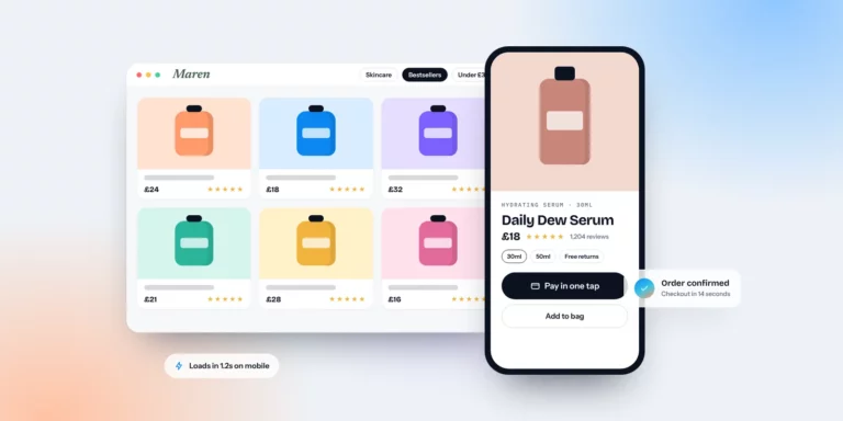
Ecommerce product page with one-tap checkout on mobile and desktop
Website · 4 min readeCommerce Website Design Essentials That Drive Sales

Mobile layouts, findable products, product pages that answer every question, real speed and a checkout with no surprises. The essentials, with checks you can run today.
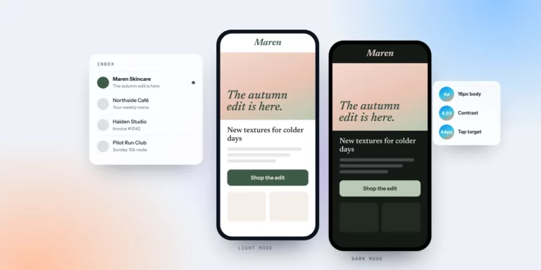
The same email in light mode and dark mode next to an inbox
Email design · 4 min readEmail Design Best Practices for the 2026 Inbox

The inbox has changed. What we focus on when designing email templates and campaigns for small businesses, and the mistakes we see most often.
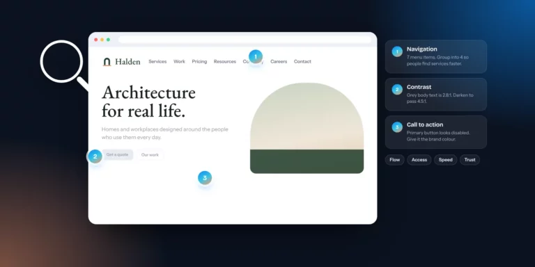
Website with numbered UI/UX review notes on navigation, contrast and call to action
Website · 4 min readUI/UX Design Reviews: Why a Fresh Pair of Eyes Helps

You know your site too well to see it clearly. What a UI/UX design review looks at, how to try one yourself and how to turn findings into fixes.
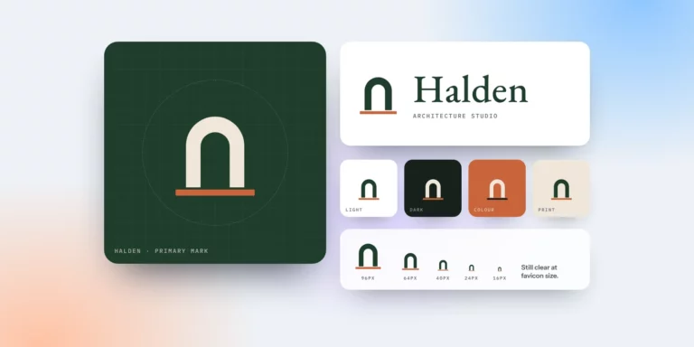
A logo system: primary mark, full logo, light and dark versions, and favicon sizes
Branding · 4 min readWhat Makes a Great Logo?

A great logo has to work as an app icon, a social avatar, a favicon and a sign on your door. Six qualities that make that possible.
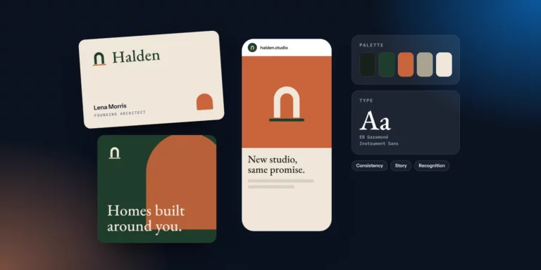
A brand identity applied consistently to a business card, social post and phone
Branding · 4 min readThe Power of Effective Branding

People meet your brand in search, social, inboxes and at your door. Effective branding makes every one of those moments feel like you.

new articles, monthly.

Sign up to our newsletter for the latest notes, examples and free checklists. Short, useful and easy to unsubscribe from.

want a second pair of eyes?

Send us your website, an email or your brand for a free design review.

Your brand next?

got a brand to launch? let’s talk.

We’re here to help. Tell us about your project and we’ll get back to you with next steps.