 October 16, 2026
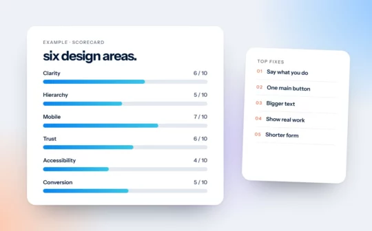
What We Look at in a Website Review
Hierarchy, calls to action, layout, user experience, brand and mobile. The six areas we score in every website review, and why each one matters.
 October 16, 2026
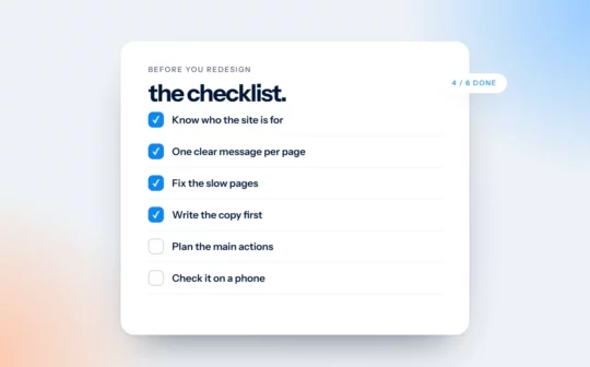
The Website Redesign Checklist: Fix These Before You Start
Before you pay for a new website, try these five fixes. Some take an hour. If the site still isn’t working afterwards, here’s what to prepare.
 October 16, 2026
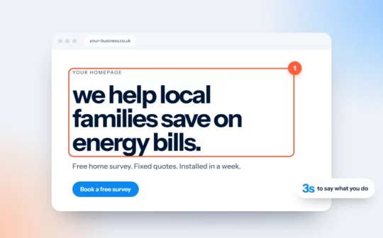
Your Homepage Headline Has Three Seconds
A stranger should be able to read your homepage headline and say what you do, who it’s for and where. Here’s a formula and a test.
 October 16, 2026
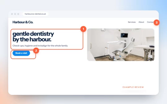
Website Review Example: A Dental Practice Homepage
We reviewed the homepage of an imaginary dental practice. Every problem on it is one we see on real sites, and so is every fix.
 October 16, 2026
7 Signs Your Website Is Losing You Customers
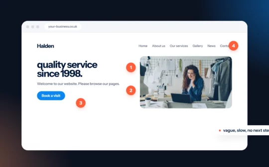
Slow pages, unclear buttons, stale news and hidden prices. Seven signs your website is turning people away, and what to do about each.
 October 16, 2026
One Primary Button Per Page: Why Fewer Choices Win
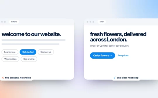
Two buttons with equal weight ask visitors to make a decision they didn’t come to make. Pick one primary button, label the outcome and repeat it.
 October 16, 2026
Design for Thumbs: Mobile Website Tips for Small Businesses
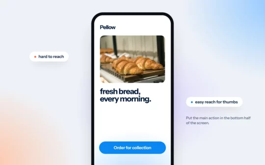
Most people browse with one hand. Five practical mobile website tips, and a quick test: can you book, buy or call with one hand, standing on a bus?
 October 16, 2026
Light Grey Text Is Costing You: A Plain Guide to Colour Contrast
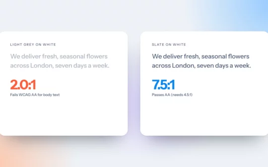
Light grey text looks elegant in a mockup and disappears on a phone in sunlight. The contrast numbers that matter, and three quick fixes.
 October 16, 2026
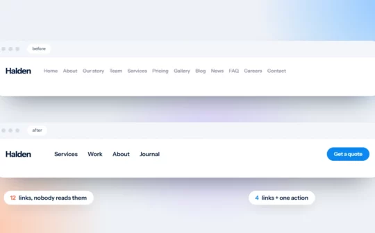
Your Menu Is Not a Sitemap: Simple Website Navigation
Your menu doesn’t need to list every page. Four rules for simple website navigation, with a before and after you can copy.
 October 16, 2026
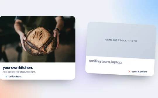
Your Website Photos Do Half the Talking
Stock photos say “any business”. Real photos say “this one”. A five-line brief and a phone-and-window method you can use this week.
