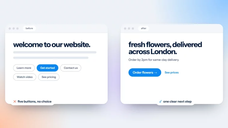
One Primary Button Per Page: Why Fewer Choices Win
When two buttons look the same, people hesitate. When one stands out, they act.

October 2026
By The Qivox team
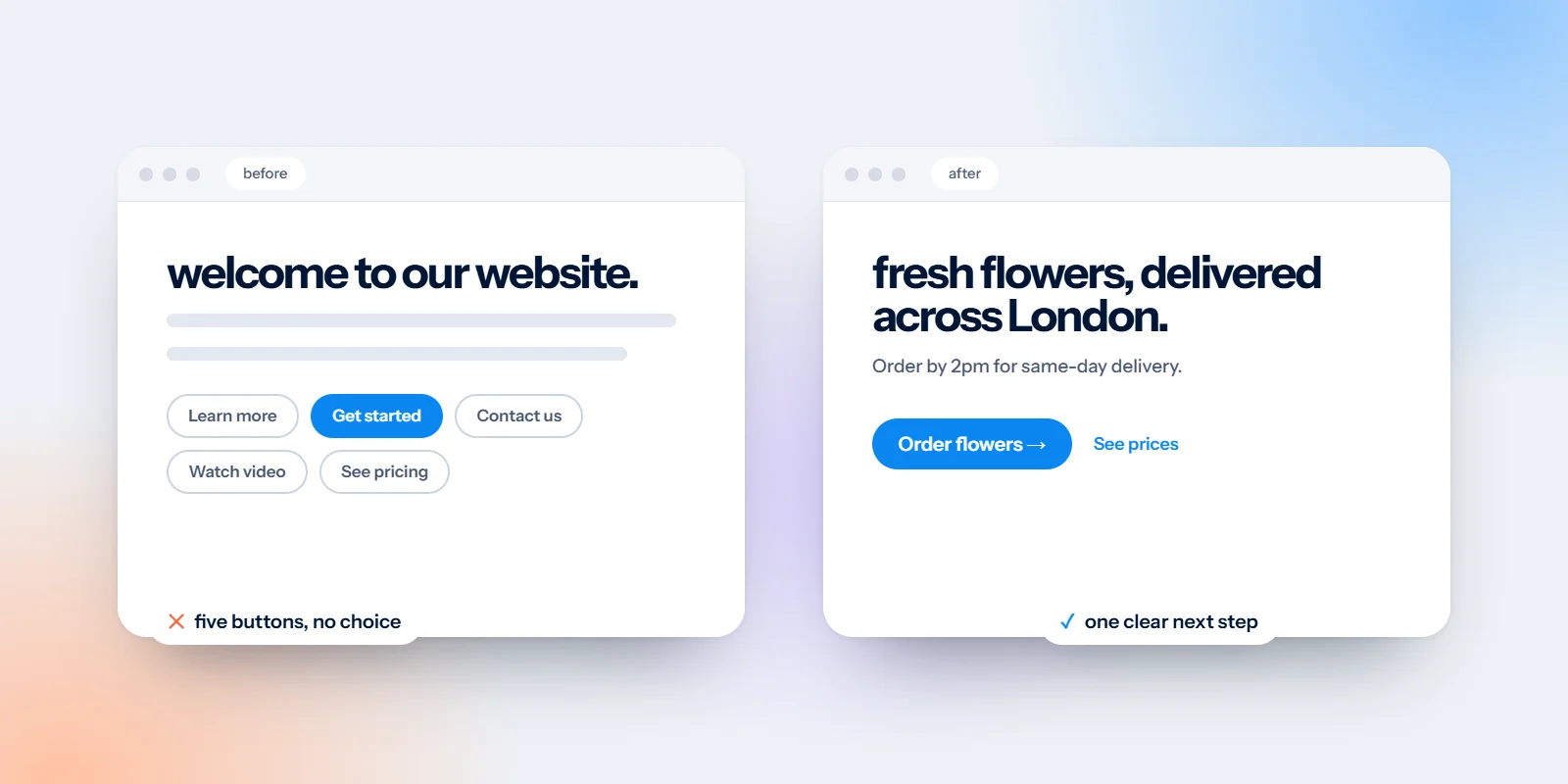
Look at the top of your homepage. How many buttons can you see? If the answer is two or three, and they’re all the same colour and size, you’ve asked every visitor to stop and choose before they’ve even read a word. A single primary button on each page removes that moment of doubt. It tells people, quietly and clearly, what the page is for and what to do next. Here’s how to pick yours, label it and place it.
Same weight, no decision
When two buttons look identical, “Learn more” and “Contact us” for example, the design is saying they matter equally. Visitors then have to work out which one is right for them. Some will pick one. Plenty will pick neither and scroll on, or leave.
Compare that with one filled button and a quiet text link beside it. “Book a free call” stands out; “See pricing” is there for anyone who needs it first. The visitor doesn’t have to think about the layout, only about whether they want what you offer. That’s the decision you actually want them to make.
One filled button. Everything else becomes a quiet link.
Choose the one action that matters most
Before you change any colours, decide what a page is for. Ask: if a visitor did only one thing here, what would be most useful to them and to the business? The answer is usually obvious once you ask the question.
Service businesses: Book a call, request a quote or check availability. Pick the first real step a customer takes with you.
Shops: Add to basket on product pages, shop a category on the homepage. Don’t compete with your own products.
Clinics and salons: Book an appointment. If phone booking is still most common, make “Call us” the primary action on mobile.
Event and hospitality: Check dates or make a reservation. A brochure download can sit as a secondary link.
Different pages can have different primary buttons. A pricing page might push “Get my quote” while a blog article points to a free guide. What matters is that each page has one clear winner.
Label the outcome, not the action
A button label is a tiny promise. “Submit” describes what the visitor does with their mouse. “Get my quote” describes what they get. The second is more inviting and sets a clear expectation of what happens next.
Submit → Get my quote: Tells people what they’ll receive, and makes filling in the form feel worthwhile.
Contact us → Book a free call: Specific, low risk and honest about what happens next. Only say “free” if it is.
Learn more → See pricing: Names the information behind the click, so people who want it can find it.
Click here → Shop the sale: Descriptive labels also help screen reader users, who often scan a page by its links and buttons.
Keep labels short, ideally two to four words, and start with a verb. Read the label on its own, out of context. If it still makes sense, it’s doing its job.
Make your primary button easy to find
A great label won’t help if nobody sees the button. Give it the strongest visual weight on the page and put it where people expect to find it.
High contrast: Use a filled colour that stands out from the background. Accessibility guidelines (WCAG) ask for at least 3:1 contrast between a button and its surroundings, and 4.5:1 for the label text on the button.
In the header, top right: This is where people look for the main action on most websites. Your menu can link everywhere else.
Repeated after every section: Don’t make someone scroll back to the top once they’re convinced. Put the same button at the end of each major section.
Sticky at the bottom on mobile: A slim bar with the button fixed to the bottom of the screen sits right under the thumb. Our guide to designing for thumbs explains why.
Use the same colour for this button everywhere on the site, and avoid using that colour for anything else that isn’t clickable. People learn quickly that blue, or orange, or green means “this is the next step”.
Common mistakes to avoid
Three equal buttons in the hero: The most common version of the problem. Keep one filled button and turn the others into text links or outline buttons.
A pop-up that competes: If a newsletter pop-up appears before someone has read the headline, it becomes the primary action by accident.
Different labels for the same thing: “Book now”, “Make an appointment” and “Reserve” on one page make people wonder if they’re different. Pick one label and stick to it.
Buttons that look like decoration: Ghost buttons with thin outlines and pale text can disappear, especially on photos or in bright sunlight.
A crowded menu: If your navigation has eight items, the button gets lost among them. See why your menu isn’t a sitemap.
Put it into practice
Open your homepage and write down every button you can see on the first screen. Choose the one that matters most, make it the only filled button, rewrite its label to name the outcome, and repeat it after each section. Then do the same on your two most visited pages. Pair it with a clear homepage headline and the first screen will do most of the selling for you.
If you’d like help building a site where every page has a clear job, our website design and development service starts with exactly that question.
Want a second opinion on your buttons? Our free website review checks your calls to action, along with everything else a first-time visitor sees.