Design for Thumbs: Mobile Website Tips for Small Businesses
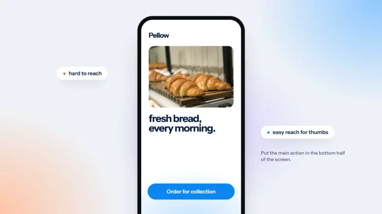
Most people scroll your site with one hand. Put the important things where their thumb can reach.

October 2026
By The Qivox team
Watch people use their phones on a train or in a queue. Most hold the phone in one hand and scroll with their thumb, while the other hand holds a coffee, a bag or a child. Yet many small business websites are still designed on a large monitor and squeezed down afterwards. These mobile website tips start from the other end: design for the thumb first, then check the desktop version still works. Every one of them is something you can check on your own site today.
Understand the thumb zone
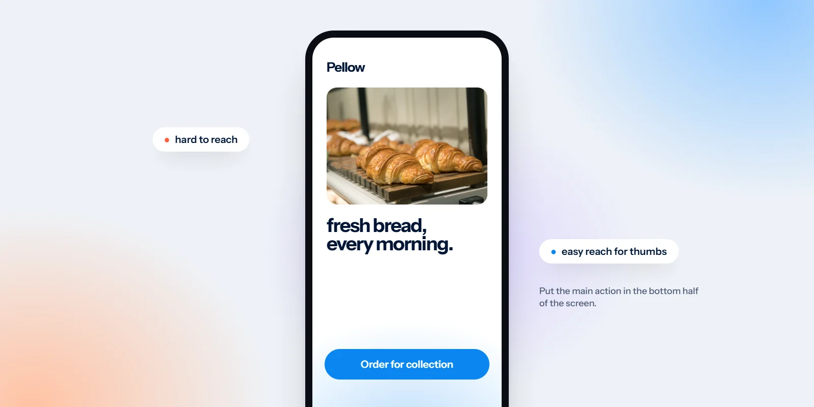
Hold your phone in one hand and move your thumb around the screen without shifting your grip. The middle and lower part of the screen is easy to reach. The top corners, especially the one opposite your thumb, are a stretch. On larger phones, they’re out of reach altogether.
That simple observation changes where things should go. Content people read can sit anywhere, because reading doesn’t need a tap. Things people do, like booking, calling, adding to basket or opening the menu, should sit where the thumb rests naturally.
The bottom of the screen is easy. The top corners are a stretch. So that’s where your main button goes.
Put the main action within reach
On a phone, your most important button should never be more than a comfortable thumb movement away. There are a few reliable ways to do that.
A sticky bar at the bottom: A slim bar fixed to the bottom of the screen with your one main action, such as “Book”, “Call” or “Add to basket”. Keep it small so it doesn’t cover content.
Repeat the button as people scroll: Place the same button at the end of each section, so it’s always nearby. Our guide to one primary button per page explains how to choose it.
Tap-to-call for local businesses: Make your phone number a proper link, so one tap starts a call. Nobody wants to memorise a number and switch apps.
Avoid actions only in the top corner: A booking link that lives only at the top right of the header is the hardest spot to reach one-handed.
Make tap targets big enough
Fingers are less precise than a mouse pointer. Small links and tiny icons lead to missed taps, accidental taps and frustration. Published guidance is consistent here.
About 44px is a good target: Apple recommends tap targets of at least 44 by 44 points, and Google’s Material guidelines suggest 48 by 48. Aim for buttons and menu links around that height.
The accessibility minimum: WCAG 2.2 sets a minimum of 24 by 24 CSS pixels for targets at level AA, or enough space around smaller ones. Treat that as the floor, not the goal.
Make the whole row tappable: In menus and lists, the entire row should respond to a tap, not just the words.
Check icons on their own: Social icons, close buttons and arrows are often the smallest things on a page. Give them a larger tappable area, even if the icon itself stays small.
Leave space between links
Two links stacked tightly together are a lottery on a phone. People aim for one and get the other, then have to go back and try again. A little breathing room removes the problem.
Start with the footer, which often crams legal pages, social icons and contact details into a few lines. Give each item its own row on mobile. Keep risky actions apart, too: “Remove” shouldn’t sit right next to “Checkout”, and “Cancel” shouldn’t touch “Confirm”, because one mis-tap there costs a sale or a booking. And don’t rely on a link buried mid-sentence for anything important. If it matters, repeat it as a button below the paragraph.
Keep menus and forms thumb-friendly
The two places mobile visitors most often give up are the menu and the form. Both are easy to improve.
Key pages one tap from the menu: Don’t hide your most important page behind a second level. If people need two taps to find your prices, many won’t bother. See why your menu isn’t a sitemap.
Fewer form fields: Ask only for what you need to reply. Every extra field is more typing with one thumb.
The right keyboard: Ask your developer to set fields up so email fields show the @ keyboard and phone fields show a number pad.
Readable field text: Form text of at least 16px also stops iPhones zooming in when someone taps a field, which is disorienting.
Clear error messages: Say what went wrong next to the field, in plain words, and keep what the visitor already typed.
Try the bus test today
Here’s the quickest check we know. Stand up, hold your phone in one hand and try to do the main thing your website is for: book, buy, call or enquire. Imagine you’re on a bus, holding a rail with the other hand. Did you need to switch grip or use your second hand? Did you tap the wrong thing? Did you get lost in the menu? If you needed two hands, your customers do too. Write down each stumble and fix the biggest one first.
For shops, run the test all the way through checkout, because that’s where small mobile problems cost the most. Our article on eCommerce design essentials covers that journey in detail.
Put these mobile website tips to work
Designing for thumbs doesn’t mean neglecting larger screens. It means starting with the hardest constraint and letting the desktop layout grow from there. When we build sites through our website design and development service, we test every key journey on a real phone, one-handed, before anything goes live.
Want to know how your site feels in one hand? Ask for a free website review and we’ll check your mobile journeys for you.