UI/UX Design Reviews: Why a Fresh Pair of Eyes Helps
You see your website every day. Your visitors don't. A review shows you the site the way they meet it.

June 2026
By The Qivox team
You’ve seen your website hundreds of times. You know where the prices are, what the menu labels mean and which button books an appointment. Your visitors know none of that. They arrive on a phone, often in a hurry, often from a search result that dropped them on a page you rarely look at. A UI/UX design review closes that gap. Someone who doesn’t know your business works through your site the way a customer would, notes where they slow down or get stuck, and gives you a short, prioritised list of what to fix. This article explains what a review covers, how to run a simple one yourself and what to do with the results.
What a UI/UX design review is
UI is the interface: the buttons, text, spacing, colours and layout. UX is the experience: whether people can do what they came to do, quickly and without confusion. A review looks at both, because they’re tangled together. A booking form can be well designed and still fail if nobody can find it.
A good review follows real journeys rather than admiring pages one by one. Find a service and its price. Book, buy or get in touch. Check opening hours or a delivery date. Along each journey, the reviewer notes friction: a vague label, a missing price, a button that’s hard to tap. The output isn’t a redesign. It’s a ranked list of changes, most of which can be made to the site you already have.
Why you can’t see your own site clearly
Familiarity hides problems. Once you know where something is, you stop noticing that it’s hard to find. You read your own headline with the context of years in the business, so it seems clear even when it says very little to a stranger. And you probably check your site on a large screen at your desk, while most of your customers use a phone on the move.
There’s also the question of habit. Sites grow one page and one plugin at a time. Each addition made sense when it was added, but nobody steps back to see the whole. An outside reviewer has no attachment to any of it, so they notice the three different button styles, the outdated offer and the menu that has quietly doubled in length.
The areas a good review covers
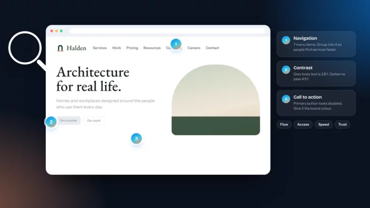
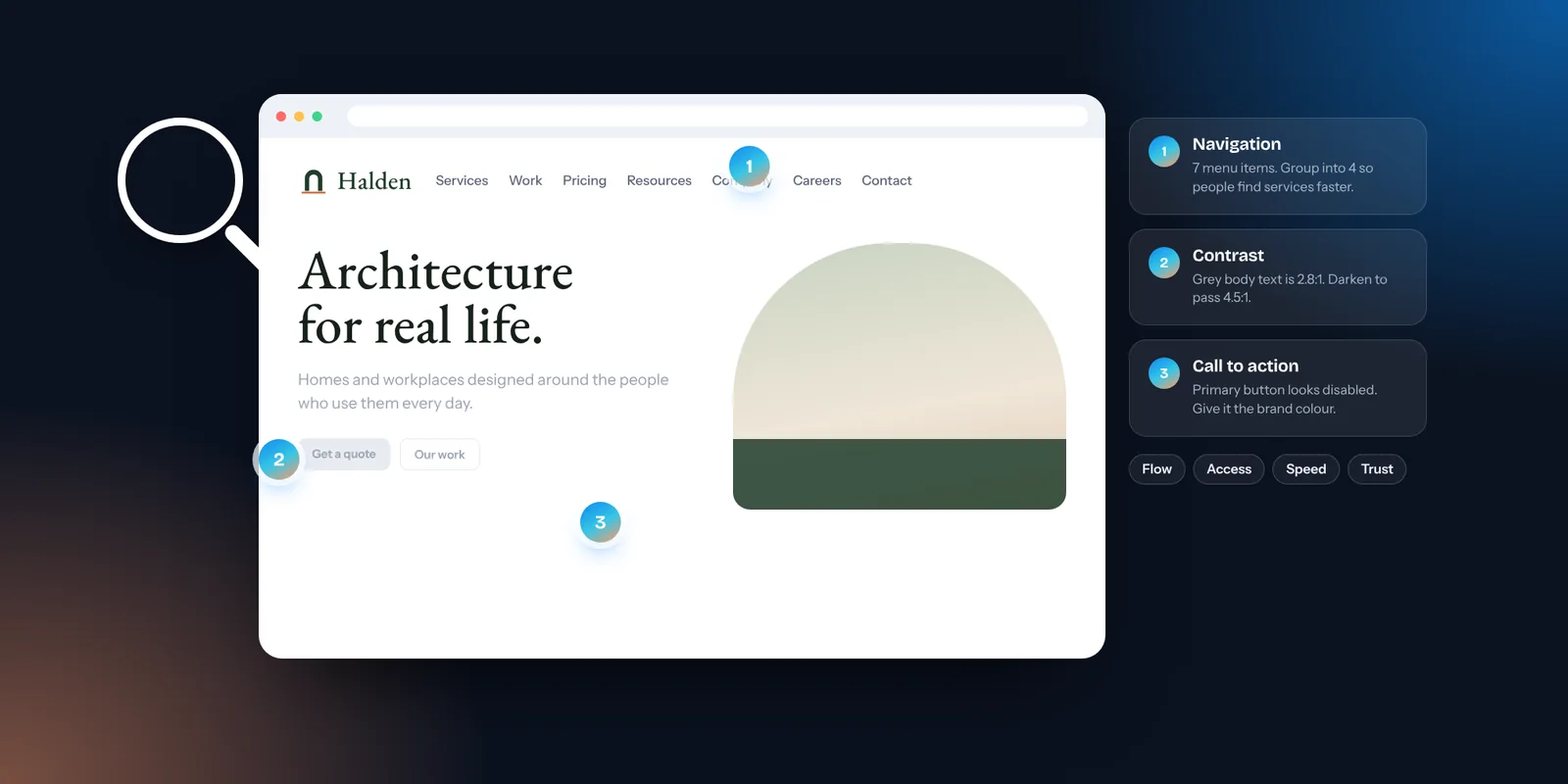
Navigation and flow: Can people find what they came for in a click or two? Are menu labels in the words customers use? Our note on simple website navigation goes deeper.
Accessibility: WCAG 2.2 is the current guideline. Body text should have a contrast ratio of at least 4.5:1, large text and interface elements at least 3:1. Every link and button should work with a keyboard, with a visible focus outline. Our guide to colour contrast explains the basics.
Mobile and speed: Does the page load quickly on mobile data? Are buttons large enough to tap and far enough apart? Does anything cover the content, such as cookie bars or pop-ups?
Clarity and trust: Does the first screen say what you do and where? Are prices, reviews and contact details easy to find? Do the photos show real people and real work?
Brand consistency: Are your logo, colours, typefaces and tone used the same way on every page? Inconsistency makes a careful business look careless.
How to run a quick review yourself
You can catch a surprising amount in an afternoon with a phone and a couple of willing friends.
The five-second test: Show someone your homepage for five seconds, then hide it. Ask what you do, who it’s for and what they’d click. Vague answers point to a hierarchy problem.
The task test: Give a friend one job, such as “find the price of a consultation and book one”, and watch without helping. Note every pause, wrong turn and question.
The thumb test: Use your site on your own phone, one-handed, on mobile data. Anything you have to zoom, pinch or tap twice goes on the list.
The keyboard test: On a laptop, put the mouse aside and press Tab to move through the page. Can you always see where you are, and can you reach the main button?
Turning findings into fixes
A review is only useful if it leads to change. Sort every finding by two questions: how much will it help customers, and how much effort will it take? Do the high-impact, low-effort fixes first. These are often a clearer headline, one primary button, a visible price or larger tap targets. Then plan the bigger pieces, such as restructuring the menu or replacing stock photos. Our website redesign checklist lists the quick wins worth trying before you consider a rebuild.
Get a free UI/UX design review
Our free website reviews are now open. A designer at the studio scores your site across six areas, marks up your pages, ranks the five fixes we’d make first and mocks up a quick concept of your first screen. You can read what we look at in a website review. If the findings point to something bigger, our website design and development service can take it from there.
See your site through a customer’s eyes. Send us your link for a free website review, with no logins needed and no sales call.