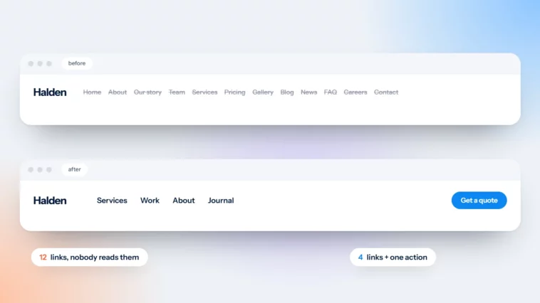
Your Menu Is Not a Sitemap: Simple Website Navigation
Eight items in capitals means eight decisions before anyone finds what they came for.

October 2026
By The Qivox team
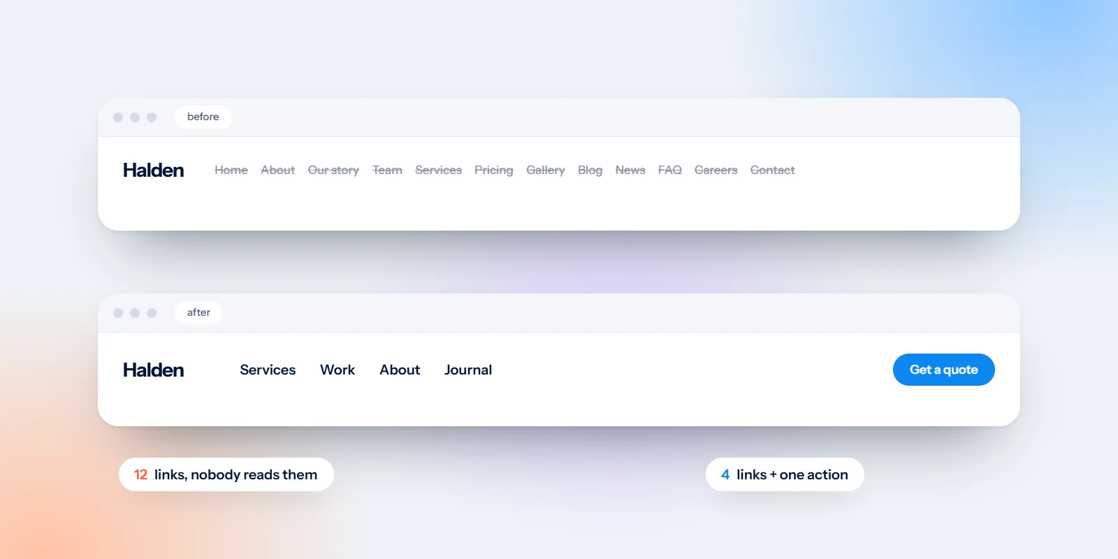
Count the items in your website’s main menu. If the number is seven, eight or more, your menu has probably turned into a sitemap: a list of every page you own, rather than a short set of signposts to the pages people actually want. Good website navigation is about choosing what to leave out. People don’t read menus. They scan for one word, the one that matches what they came for, and every extra item makes that word harder to spot. Here’s how to trim yours.
Why long menus cost you
Take a typical dental practice website. The menu reads: HOME · ABOUT US · TREATMENTS · FEES · OUR TEAM · PATIENT INFO · NEWS · CONTACT US. Eight items, all in capitals, all the same weight. A new patient looking for prices has to read along the row, wonder whether fees live under Patient Info or Treatments, and then decide. On a phone, the same list becomes a long column inside a menu they had to open first.
Now picture the same site with four items and a button: Treatments, Fees, About, Contact, and a filled Book button on the right. Nothing important has disappeared. The team page now sits inside About. Patient information is linked from the relevant treatment pages and the footer. News moves to the footer. The visitor sees fewer choices, so they find the right one faster.
Fewer choices, faster clicks. People don’t read menus. They scan for one word.
Keep your website navigation to 4–6 items
Four to six items is a comfortable range for most small business sites. It fits on one line on a laptop and makes a short, scannable list on a phone. To get there, run a quick audit.
List every current item: Write down everything in your menu, including dropdowns. Seeing it all on paper often makes the problem obvious.
Ask what customers come for: Think about the questions people ask on the phone or by email. If your analytics show your most visited pages, start with those.
Drop “Home”: Your logo already links to the homepage on almost every website. A separate Home item is one more word to read.
Group the rest: Team, history and values can live on one About page. Individual services can sit under one Services or Treatments item.
Be wary of dropdowns: A dropdown can hide a long list, but it doesn’t shorten it. If a dropdown has more than five or six links, the page it belongs to probably needs a better overview.
Use your customers’ words, not yours
Menu labels should match the words people already have in their heads. Businesses often drift towards internal or marketing language that sounds polished but makes visitors hesitate. A short, plain word beats a clever one every time.
“Investment” → “Fees”: People look for prices. Call them prices or fees.
“Our philosophy” → “About”: Visitors know where to find About. They have to guess at Philosophy.
“Offerings” → “Services”: Or better, name what you do: Treatments, Menus, Courses, Workshops.
“Connect” → “Contact”: Clear beats trendy. Everyone knows what Contact means.
A good test is to ask a friend outside your industry where they’d click to find your prices, your opening hours and your address. If they hesitate, rename the item. The same principle applies to your headline; see your homepage headline has three seconds.
Make the main action a button, top right
Your most important action, such as Book, Get a quote or Shop, shouldn’t sit in the menu as just another word. Take it out of the list and make it a filled button at the right-hand end of the header. It stands out, it’s where people expect it, and it frees up a slot in your menu. Keep it visible on mobile too, next to the menu icon rather than hidden inside it. We explain how to choose and label that button in one primary button per page.
Put everything else in the footer
Trimming the menu doesn’t mean deleting pages. The footer is where people go when they’re looking for something specific, and it can hold far more than the header.
Practical details: Address, phone number, opening hours and a map link. Many visitors scroll straight to the bottom for these.
Secondary pages: News, careers, FAQs, gift vouchers and resources.
Legal and policy pages: Privacy policy, cookie policy, terms, complaints procedure and an accessibility statement if you have one.
Social links: Your social profiles belong here rather than in the header, where they tempt people away from your site.
On mobile, check that footer links are well spaced and easy to tap. Our guide to designing for thumbs covers spacing and tap targets.
Simplify your menu today
Count your menu items, cross out anything a new visitor doesn’t need on their first visit, rename anything that uses your words instead of theirs, and move the main action into a button. You can usually make these changes in your website platform’s menu settings in under an hour. If your navigation reflects a site that has grown without a plan, it may be time for a rethink. Our website design and development service starts by mapping what visitors need, then builds the menu around it.
Want a fresh pair of eyes on your menu? Ask for a free website review and we’ll show you what to keep, rename and move.