What We Look at in a Website Review
Six design areas, each scored out of five, and the questions we ask about every one.

October 2026
By The Qivox team
When you send us your link for a free website review, a designer at the studio looks at your site the way your customers do: on a laptop and on a phone, without any background knowledge, trying to get something done. We score six design areas out of five, write short notes on each, and rank the fixes that will make the most difference. This article explains what those six areas are, the questions behind each score, and how you can ask the same questions of your own site today.
How the scoring works
Each area gets a score from 1 to 5, so a site can score up to 30 in total. A 1 means the area is actively getting in the way. A 3 means it works but undersells you. A 5 means we wouldn’t change much. The scores are there to show where your effort will pay off first, not to grade you. A site with a 2 for calls to action and a 4 for everything else has a clear, cheap fix waiting.
It’s a design review, so we look at what visitors see and do. We focus on the pages most people land on, starting with your homepage, and we never need a login or access to your site.
Visual hierarchy and calls to action
01 Visual hierarchy: Where does your eye go first, and is that the most important thing on the page? We look at headline size and wording, the order of information and whether anything competes for attention. Try it yourself: glance at your homepage for three seconds, look away, and note what you remember. If it’s a slider or a stock photo rather than what you do, hierarchy is the fix. Our note on homepage headlines helps here.
02 Calls to action: Is the next step obvious, and does the button say what happens? We check whether each page has one primary action, whether it’s visible without scrolling and whether the label is specific. “Book an appointment” scores better than “Find out more”. Count the buttons on your homepage that look equally important. More than one is usually too many.
Interface, layout and user experience
03 Interface and layout: Spacing, alignment and consistency. These details are easy to dismiss, but uneven gaps, three button styles and text that runs edge to edge make a business feel less careful than it is. We also check text contrast against the WCAG AA guideline of 4.5:1 for body text. Look at your site zoomed out: do things line up, and do similar elements look the same everywhere?
04 User experience: Can people find prices, services and contact details without hunting? We try the tasks a new customer would: find out what you offer, what it costs, where you are and how to get in touch. We note every dead end, vague menu label and extra click. If your menu has more than five or six items, our guide to simple website navigation is worth a read.
Brand, imagery and mobile
05 Brand and imagery: Does the site look like you, or like everyone else in your industry? We look at whether your logo, colours and type are used consistently, whether the photos show real people and real work, and whether the tone of the words matches the business. Swap your logo for a competitor’s in your head. If nothing else would need to change, the brand isn’t doing enough.
06 Mobile: Does it work with one thumb, on a small screen, on a slow connection? We test on a phone, not just a narrow browser window. We look at what fits on the first screen, whether buttons are easy to tap, whether pop-ups or cookie bars cover the content, and whether the main action stays within reach. Most of your visitors are probably here, so this area often matters most.
What you get back
Your review arrives as a short PDF, usually within five working days. It’s written by a designer, not generated by a tool, and it’s yours to use however you like.
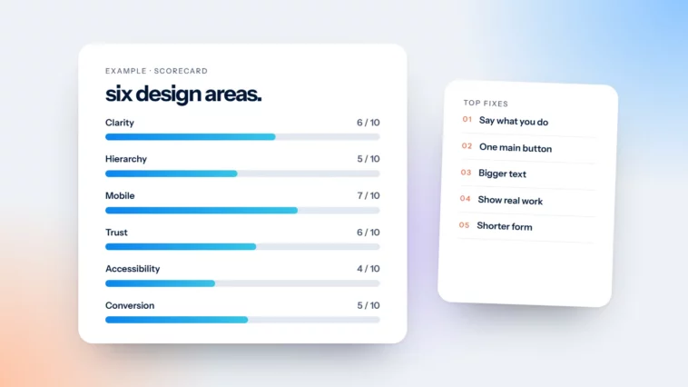
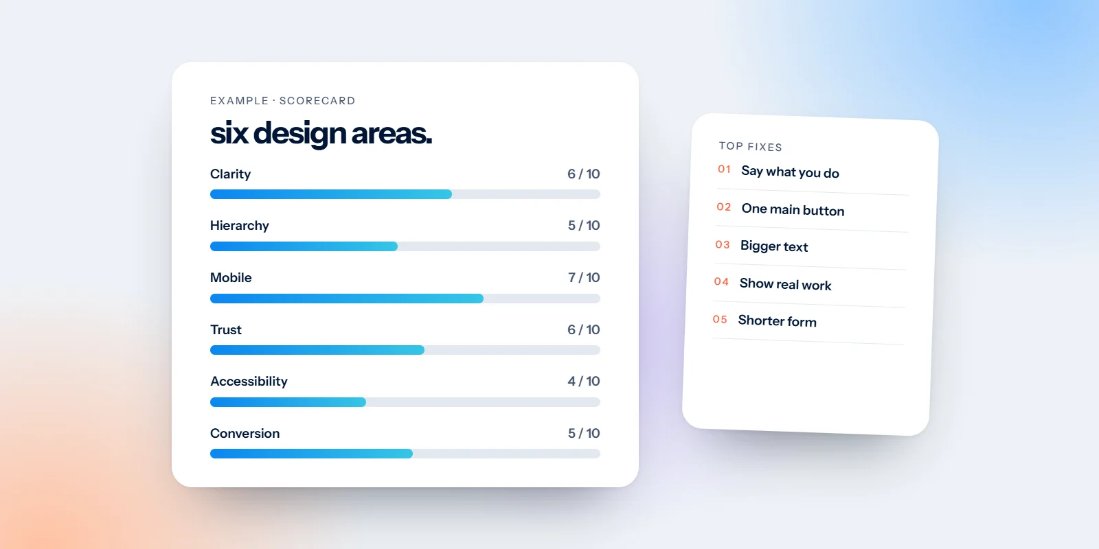
A scorecard: Your six scores with a one-line note on each, plus a short verdict and a list of what’s already working well.
Your pages, marked up: Annotated screenshots showing exactly where the problems are, so there’s no guessing what we mean.
Your top five fixes: Ranked by impact, with an honest note on effort. Many can be done by whoever looks after your site.
A quick concept: Your first screen with the top fixes applied, on desktop and on mobile, so you can see the difference.
An optional quote: If you’d like us to make the changes, there’s a fixed-price quote at the end. There’s no obligation and no sales call.
Want to see one in practice? Our website review example for a dental practice walks through a full review of an invented site, scores and all.
Get your own free website review
You can run through the six areas on your own site this week using the questions above. If you’d like a second pair of eyes, or the review points to something bigger, our website design and development team can take it from there.
Send us your link for a free website review: six scores, five ranked fixes and a quick concept, in your inbox within about five working days.

