What Makes a Great Logo?
Six qualities of a logo that works everywhere, from a shop sign to a 16-pixel browser tab.

April 2026
By The Qivox team
Your logo has a harder job than it used to. It still goes on your sign, your cards and your invoices, but it also has to work as a social avatar, a browser tab icon, an app icon, an email signature and, increasingly, a short animation at the end of a video. So what makes a great logo today is less about a single beautiful drawing and more about a mark that holds up in all of those places. This guide sets out the six qualities we look for, a quick way to check your own logo, the mistakes we see most often, and how a logo fits into the wider brand.
What makes a great logo: six qualities
None of these is about style. A great logo can be playful or serious, geometric or hand-drawn. These qualities are about whether it works.
Simplicity: One clear idea, drawn with as few parts as possible. Simple marks are easier to remember, easier to reproduce and survive being made very small. If you need to explain a logo for it to make sense, it is probably doing too much.
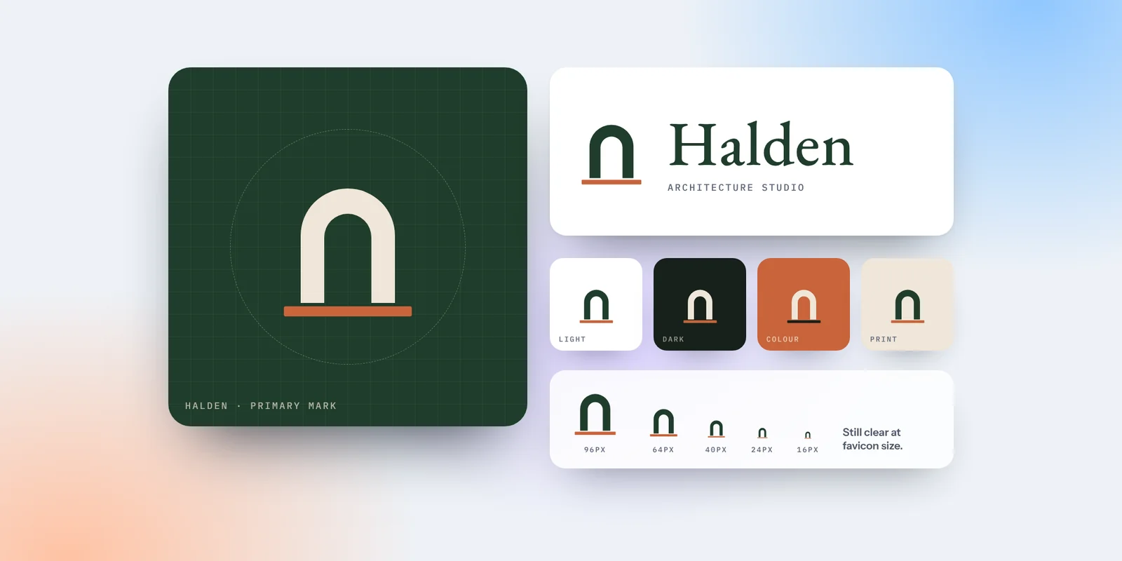
A responsive system: Not one logo but a small family: a full version, a compact or stacked version and a symbol on its own. Each is designed for a different space, so you never have to squash the full logo into a circle.
Works in light and dark: Websites, apps and email apps now switch between light and dark modes. A great logo has versions for both, so it never disappears against the background.
Relevance: The mark should suit the business and the people it serves. A luxury chauffeur service and a children’s party planner need very different signals, even if both want to look professional.
Built to move: Logos now appear in reels, stories and video intros. Clean shapes with a clear structure are easy to animate in simple ways, such as drawing on or a gentle reveal.
Timelessness: A great logo should still look right in ten years. Marks built on a clear idea last longer than marks built on this year’s trend.
Two logos and the idea behind them
Good logos usually start from one idea that can be said in a sentence. Here are two from our own work.
For Delta Luxury Transport, a chauffeur service in Athens, the mark pairs a small crown with the Greek letter Δ. It says premium and it says Greece, in one simple shape that works in amber on a dark background. You can see it in the Delta Luxury Transport case study. For Evgnosia, the logo is a bespectacled owl with a clean lowercase wordmark: friendly, a little wise, and simple enough to remember. The Evgnosia case study shows the mark and icon together. In both cases, the idea comes first and the drawing serves it.
If you can describe your logo in one sentence, people can remember it.
How to check the logo you already have
You do not need a designer to spot most problems. Spend ten minutes on these checks.
Shrink it: View your logo at 16 pixels, the size of a browser tab icon. If it turns into a smudge, you need a simpler small version.
Put it in a circle: Crop it into a circle, as social platforms do. If the name becomes unreadable, you need a compact or symbol version.
Try it in one colour: Fill the whole logo with black. If it stops making sense, it relies too much on colour or gradients.
Reverse it: Place a white version on your darkest brand colour. Thin lines and small gaps often struggle here.
Describe it: Ask someone who knows your business to describe your logo from memory. What they remember is what is working.
Our guide on how to test your logo in five places goes through each check in more detail, with what to do if one fails.
Common logo mistakes
Overcomplicating it: Fine detail, several icons and long taglines all built into the mark. They look fine on a large screen and fall apart everywhere else. Keep the tagline separate.
Only having one version: A single wide logo forced into square avatars, narrow headers and tiny icons. A small family of versions fixes this.
Copying trends: Fashionable effects date quickly, and a logo that looks like everyone else’s in your industry is hard to remember.
Skipping guidelines: Without a few simple rules on spacing, sizes and colours, the logo gets stretched, recoloured and placed on busy photos within months.
A logo is the start, not the whole brand
A great logo signs your work, but it cannot carry a brand on its own. People recognise you by the combination of mark, colour, type, photography and words, used the same way everywhere. We explain the difference in a logo is not a brand. That is why we treat a logo as part of a complete system: a set of versions, a palette with clear roles, typefaces and short guidelines that keep it all consistent.
If you are planning a new logo or wondering whether your current one is holding you back, our brand identity service covers the logo suite and everything it needs to work alongside. If you are not sure yet, start with a second opinion.
Is your logo working everywhere it needs to? Request a free brand review and get your top 5 fixes in a short PDF.