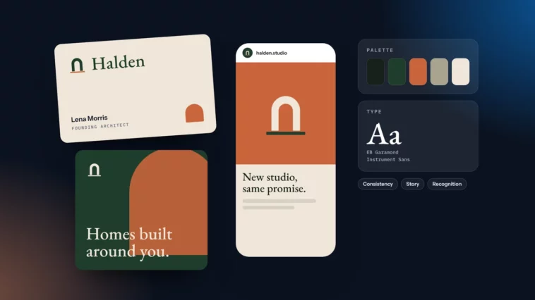
The Power of Effective Branding
Why consistency, a clear story and a distinctive look matter more than ever for small businesses.

February 2026
By The Qivox team
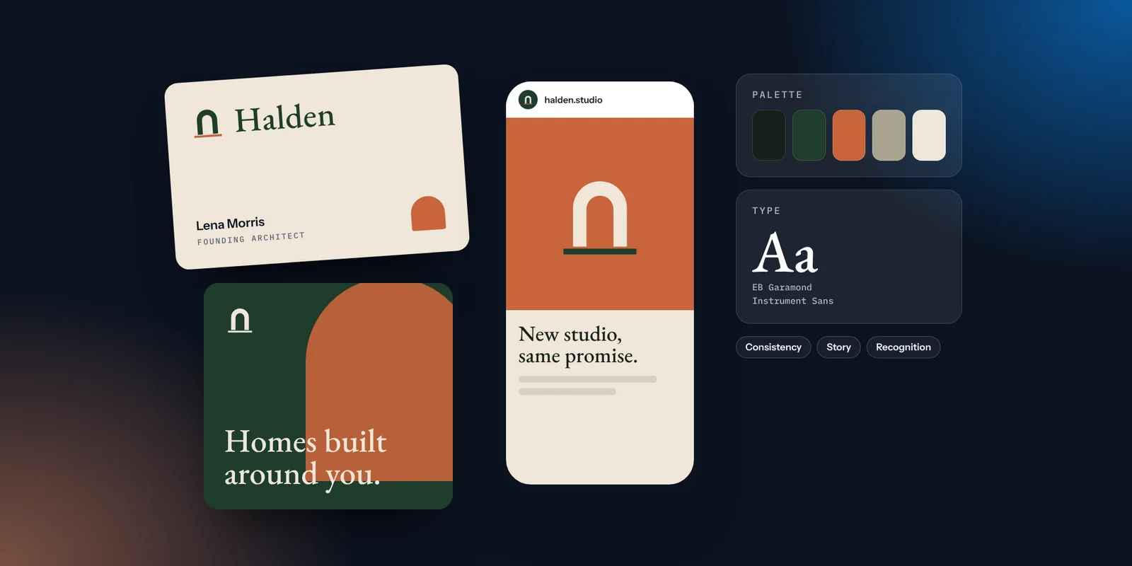
People now meet your business in more places than ever: a search result, a social post, a marketplace listing, an email, a map pin, an answer from an AI assistant, and finally your website or your front door. Each of those is a small first impression. Effective branding is what makes them add up to one clear picture, so that by the time someone is ready to buy, they already know who you are and what to expect. This article explains what makes a brand effective, what it does for a small business, and five practical things you can do this month.
What effective branding really means
Branding is often treated as a logo and a colour. Those matter, but they are only the visible part. Your brand is the whole experience of dealing with you: how you look, how you sound, how easy you are to understand and how you make people feel. A logo signs that experience. We explore the difference in a logo is not a brand.
That is good news for small businesses. You do not need a large budget to have an effective brand. You need a clear idea of who you are, a simple visual system, and the discipline to use both everywhere.
What makes a brand effective
In our experience, effective brands share four qualities. Each one is something you can check and improve.
Consistency: The same name, logo, colours, type and tone in every place. Consistency is what turns a series of separate impressions into recognition. It is also the quality that slips first when a business gets busy.
A clear story: A short, specific explanation of what you do, who for and why you are different. If people can describe you in a sentence, so can search engines and AI tools that summarise businesses for their users.
Emotional connection: The feeling people get when they deal with you: reassured, excited, looked after, impressed. Colour, photography and tone of voice all shape it.
Distinctiveness: Something people can remember you by that your competitors do not share. A colour, a phrase, a photographic style, a way of doing things.
A quick way to test all four: look at your homepage, your last three social posts and your business card together, then ask a friend to describe your business in one sentence after a ten-second look. If the description is vague, the story needs work. If they could be describing a competitor, you need something more distinctive. If they hesitate because the pieces look different, start with consistency. Most small brands are strong on one or two of these qualities and weak on the others, and knowing which is which tells you where to spend your time.
Consistency builds recognition. Distinctiveness makes it yours.
What it does for a small business
Effective branding is not decoration. It does practical work, even if it is hard to measure directly.
Recognition: When everything looks and sounds the same, people start to recognise you before they read your name. That makes every post, email and leaflet work a little harder.
Credibility: A consistent, considered brand signals that you take care over details. Customers often assume the service will be the same.
Loyalty: People return to businesses they feel they know. A clear identity makes you easier to remember and easier to recommend.
Easier decisions: A clear brand also helps you. When you know your colours, type and tone, making a new menu or post takes less time and fewer debates.
For Imagia Events, an events studio in Athens, the brand is built on one signature colour, a violet used across everything, with the violet ray of its logo signing each piece and a new mood kit for every event. Every invitation and post is different, yet always clearly Imagia. The Imagia Events case study shows how it comes together.
Five things you can do this month
None of these needs a rebrand. Each one makes your existing brand more effective.
Write your one-sentence story: What you do, who for, and the one thing that makes you different. Put it at the top of your homepage and in your social profiles. Our guide to saying what only you can say helps with this.
Line up your touchpoints: Put your website, social feed, email, cards and signage side by side. Note every place the name, logo, colours or fonts differ.
Choose your references: Pick the best version of your logo, your main colours and two typefaces. Write them down in a single page your team can find.
Fix the most visible piece first: Usually the website homepage or your social profile. Make it match your references before anything else.
Agree three words for your tone: For example: warm, plain, confident. Read every new headline against them before it goes out.
If you would like to see what this looks like in practice, our brand review example follows an invented bakery from four inconsistent brands to one clear system.
How we help
Our brand identity work starts with the story: what makes you different and who you are for. From there we design the identity, including the logo suite, colour palette, typography and imagery direction, and finish with short guidelines and templates so the brand stays consistent long after handover. If you already have a brand and want to know how effective it is, a review is the quickest place to start.
How effective is your brand today? Request a free brand review for a scorecard and your top 5 fixes.