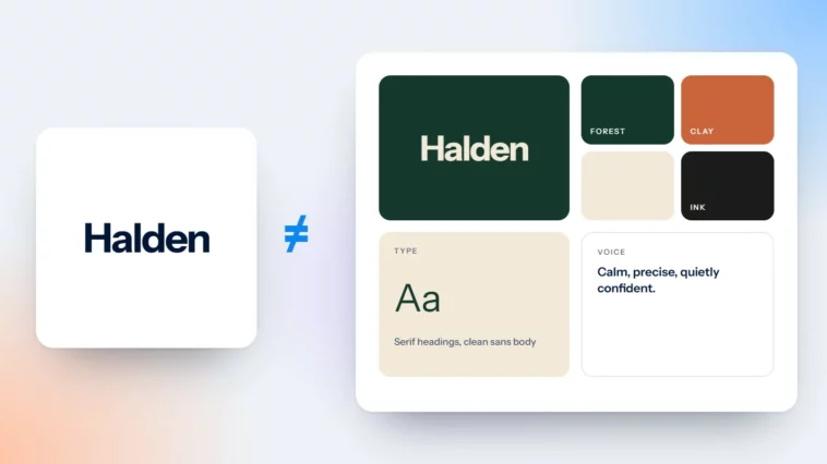
A Logo Is Not a Brand: What a Brand Identity Really Includes
A logo signs your work. A brand is what people expect, feel and say about you.

October 2026
By The Qivox team
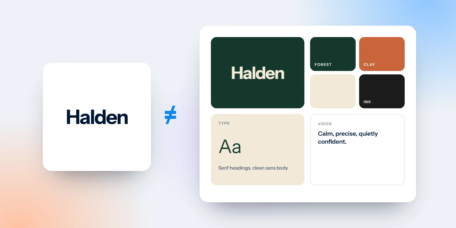
Most small businesses start with a logo, and that is a sensible place to start. But a logo on its own is not a brand, and treating it as one is why so many businesses look slightly different everywhere they appear. A brand identity is the full set of tools that makes you recognisable: the logo, yes, but also your colours, type, photography, words and the rules that hold them together. This article explains the difference in plain terms, shows what a working identity includes, and gives you a short audit you can run on your own business this week.
A logo is a signature
A logo tells people who made something. It sits on your sign, your invoices, your website header and your Instagram avatar, and it says: this is us. That is an important job. A clear, well-drawn logo that works at every size saves you money and embarrassment for years.
But a signature cannot do everything. It cannot tell someone whether you are calm or lively, premium or good value, a specialist or a generalist. It cannot make a social post feel like it came from the same business as your shopfront. Those jobs belong to the rest of the identity. If you want the detail on what makes the mark itself strong, our guide to what makes a great logo covers it.
A brand is a reputation
Your brand is what people expect from you, how they feel about you, and what they say about you when you are not in the room. You cannot design that directly. You build it, slowly, every time someone meets you: when they land on your website, open your email, see your post, pick up your packaging or speak to your team.
Design matters here because it makes those moments consistent. When every touchpoint looks and sounds like the same business, people start to recognise you without reading your name. When every touchpoint looks different, each one has to introduce you from scratch. That is wasted effort, and it quietly undermines trust.
You can design a logo in weeks. A brand gets built every time someone meets you.
What a brand identity really includes
A working brand identity is a small system, not a single file. Here is what we expect to see, whether we are building one or reviewing one.
A logo suite: The main logo, a stacked or compact version, a small icon and a favicon, each in colour, black, white and reversed. One PNG is not enough.
A colour palette with roles: Not just a list of colours, but which one is for backgrounds, which for text and which for buttons. Our note on the 60-30-10 colour rule explains a simple way to set those roles.
Typography: Usually two typefaces: one with personality for headlines and one built to be read for everything else, with sizes for each.
An imagery style: How your photos should look: light, colour, subject and framing. A consistent style does as much for recognition as the logo.
A tone of voice: A few plain rules for how you write. Short or long sentences, formal or friendly, words you use and words you avoid.
Guidelines and templates: A short rulebook and ready-made layouts for the things you make often, so the identity survives contact with a busy week.
Where your brand gets built
The identity only matters if it turns up in the places customers actually see. These are the touchpoints we check first, with one thing to look at in each.
Your website: Is the logo the current version? Are buttons all the same colour? Do headings use the same typeface on every page?
Your emails: Does your newsletter header match your website, or was it built from a template years ago and never updated?
Your social posts: Scroll your last twelve posts. Do they look like one business, or like twelve different designers had a go?
Print and packaging: Business cards, menus, bags, labels and signage. These are often printed once and forgotten, so they drift furthest.
Your service: How you answer the phone, how you sign off emails, what your invoice looks like. Small moments, all part of the reputation.
A brand identity audit you can do this week
You do not need a designer to see whether your identity is holding together. Set aside an hour and do this.
Gather everything: Screenshot your homepage, your last email, three social posts and your Google Business Profile. Photograph your card, sign and any packaging.
Lay it out side by side: Put it all on one screen or one table. Inconsistency that is invisible one piece at a time becomes obvious when everything is together.
Count the variations: How many versions of the logo? How many main colours? How many typefaces? More than one logo, four or five colours or two typefaces is a warning sign.
Read it aloud: Read the headline from each piece. Do they sound like the same person wrote them?
Pick the best version: Choose the strongest example you already have and make it the reference. Fix the others to match before you make anything new.
If this throws up a long list, that is normal. Our brand review example walks through an invented bakery with exactly this problem: four names, four colour schemes and five typefaces, and how one simple system fixed it.
How we design the whole system
When we take on brand identity work, we design the logo and everything it needs to work alongside: palette, type, imagery direction, guidelines and templates for the things you make most. For Imagia Events, an Athens events studio, that meant a signature violet used everywhere, a mark that signs every piece, and a new mood kit of accents for each event. You can see how it fits together in the Imagia Events case study.
If you are not sure whether your current identity needs a refresh or just some tidying, a second opinion helps. We look at your logo, colour, type, imagery and how it all holds together, and tell you what to fix first.
Does your brand look like one business everywhere? Get a free brand review: a short PDF with your scorecard and top 5 fixes.

