Test Your Logo in Five Places Before You Approve It
Circle crop, one colour, reversed, on a photo and tiny. Five minutes now saves a reprint later.

October 2026
By The Qivox team
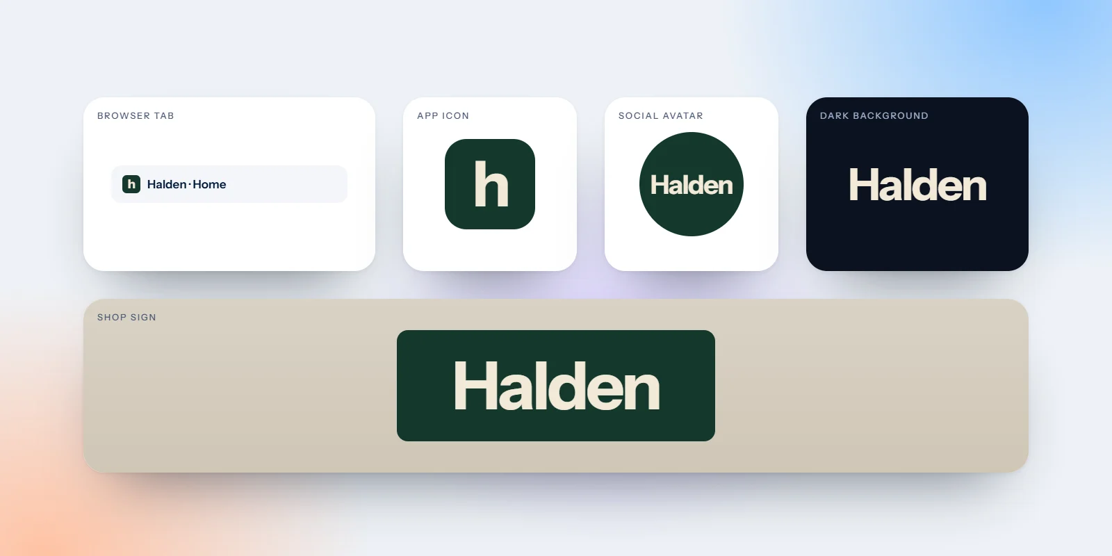
Most logos are approved in the same place: large, in full colour, centred on a white background. That is the one place your logo will almost never appear. In real life it gets cropped into circles, printed in a single ink, placed on dark backgrounds and photos, and shrunk to the size of a fingernail. Before you sign anything off, test your logo in the five places below. Each test takes a minute or two, needs no special software, and catches problems that are cheap to fix now and expensive to fix after the signs and cards are printed.
Why you should test your logo before approving it
Once a logo is approved, it starts multiplying: on your website, your van, your uniforms, your packaging, your social accounts. Every one of those is harder to change than the last. A problem found at the approval stage might mean an hour of design time. The same problem found after printing means reprints, a second round of signage and a period of looking inconsistent while you replace everything. The tests below are the ones we run on every logo before it leaves the studio.
Tests one and two: the circle crop and one colour
01 · As a profile picture: Drop the logo into a circle, as Instagram, LinkedIn, WhatsApp and Google all do. Wide logos become tiny in the middle, and corners get cut off. Can you still tell who it is when it is the size of a thumbnail in a list of messages?
How to check it: Make a square image, put the logo in the middle and upload it to a private account, or simply view it through a circular crop on your phone. Look at it small, not full screen.
02 · In one colour: Turn the whole logo into a single solid colour, with no gradients, shading or tints. This is how it will look on a rubber stamp, embroidered on a shirt, engraved, or printed in one ink on a paper bag.
How to check it: Fill every part of the logo with black. If shapes merge into a blob, or parts disappear because they only worked as a lighter tint, you need a dedicated one-colour version.
Tests three and four: reversed and on a photo
03 · Reversed, on a dark background: Put a white version of the logo on a dark colour, such as navy or black. Thin lines can look thinner, and letters can appear to glow and lose shape. Colours chosen for white backgrounds often clash on dark ones.
How to check it: Try your logo on your darkest brand colour and on plain black. If it looks weaker, the fix is usually a reversed version with slightly heavier strokes or adjusted colours, not a new logo.
04 · On top of a photo: Place the logo over one of your real photos, as it would sit on a website banner, a social post or a poster. Busy images swallow fine detail and mid-tone colours.
How to check it: Test it on a light photo and a dark photo. If it disappears on either, plan where the logo is allowed to sit, such as on a calm area or a solid panel, and write that into your guidelines.
Test five: tiny, as a browser tab icon
05 · As a favicon. The icon in a browser tab is 16 pixels across. It is also where many people see your logo most often, along with app icons, bookmarks and email signatures. At that size, thin lines vanish, small gaps fill in and any text becomes unreadable.
To check it, shrink the logo to 16 pixels and look at it at actual size, not zoomed in. Better still, add it to a test web page and open it in a browser next to your other tabs. The answer is almost never to shrink the full logo. Simplify it instead: drop thin lines, open up tight gaps, remove detail and keep the most recognisable shape. For Imagia Events, the mark was designed to work as a small square app icon as well as on large printed invitations. You can see it in the Imagia Events case study.
Simplify, don’t shrink. A logo that works at 16 pixels will work almost anywhere.
If it fails a test
Failing one of these tests rarely means starting again. It usually means the logo needs a family around it rather than a single version. Most strong brands use three or four.
A stacked or compact lockup: For square spaces and circle avatars, where a wide logo would be too small.
A one-colour version: Drawn specifically to work in a single ink, for stamps, embroidery and engraving.
A reversed version: Adjusted for dark backgrounds rather than simply turned white.
A small icon: A simplified mark for favicons, app icons and anywhere under about 32 pixels.
These versions are part of what a complete logo suite should include. Our guide to what is included in a brand identity package covers the full list, and what makes a great logo explains the qualities that help a mark pass these tests in the first place.
Five tests, five minutes
Run these tests before printing anything, and again on any logo you already use. If your current mark struggles in two or more places, a small set of extra versions may be all you need. Every logo we create as part of our brand identity work ships with a small-size version, alongside the other versions it needs to pass all five tests.
Want a second pair of eyes on your logo? Request a free brand review, with a scorecard and your top 5 fixes.

