 October 16, 2026
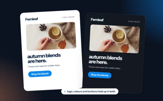
How to Design Emails for Dark Mode
Many subscribers read email in dark mode. Here’s how to keep your logo visible, your text readable and your buttons looking like buttons, whatever the inbox does.
 October 16, 2026
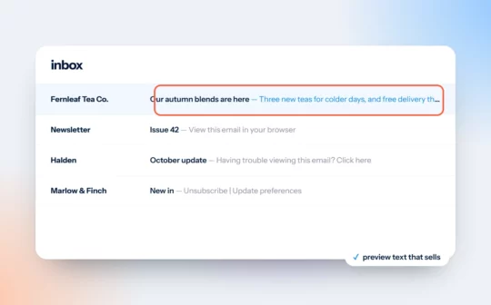
Email Preview Text Is Your Second Subject Line
The grey line next to your subject is a second chance to earn the open. Four rules, a before and after, and the template details that stop it going to waste.
 October 16, 2026
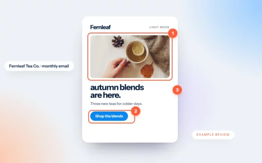
Newsletter Review Example: A Tea Shop’s Monthly Email
We mark up an invented tea shop’s newsletter: an offer hidden in a photo, four paragraphs before anything to click, and a lonely “click here”. Then we fix it.
 October 16, 2026
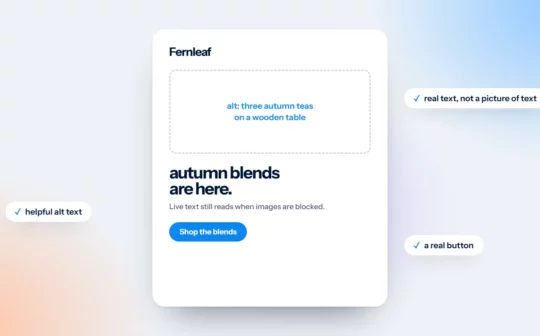
Design Emails That Still Work With Images Off
An email made of one big image becomes a blank box when images don’t load. Four design habits that keep your message readable either way.
 October 16, 2026
Why Gmail Clips Your Emails, and How Design Can Avoid It
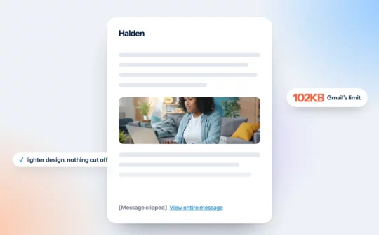
Gmail hides the end of emails over about 102KB. What gets lost, why it matters, and the design decisions that keep your campaigns light.
 October 16, 2026
Fonts in Email Design: What Works in Every Inbox
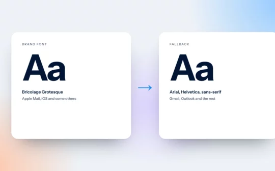
Custom fonts only show in some inboxes. Everyone else sees a fallback, so choose it on purpose. Safe fonts, the Outlook trap and type that reads well on a phone.
 July 28, 2026
Email Design Best Practices for the 2026 Inbox
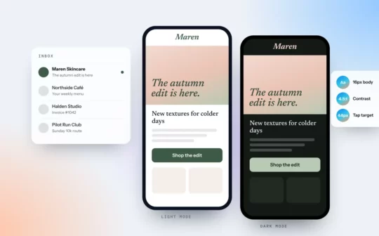
The inbox has changed. What we focus on when designing email templates and campaigns for small businesses, and the mistakes we see most often.
