Newsletter Review Example: A Tea Shop's Monthly Email
Lovely photos, a good offer, and almost nobody would see it. An invented newsletter, marked up and redesigned.

October 2026
By The Qivox team
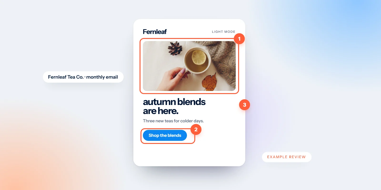
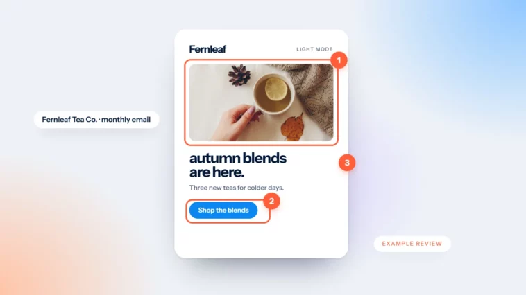
This is a newsletter review example: a walk-through of how we look at a campaign during a free email design review. The brand, Fernleaf Tea Co., is invented. We made it up to show how a review works without picking on a real business, and it isn’t a client. The problems, though, are ones we see all the time: lovely photos, a good offer, and an email where almost nobody would see either.
The email we started with
Fernleaf’s October newsletter opens with its logo, then a large photo of tea leaves with “20% off autumn blends” written across it. Below that come four centred paragraphs about the season, the shop and a new supplier. Then three product photos with names but no prices. The only link is the words “click here” at the end of the last paragraph.
In the inbox, the subject line is “Fernleaf Newsletter – October”. Nobody set the preview text, so it reads “View this email in your browser. Dear Tea Lover, as the leaves…”. It’s a pleasant email. It just doesn’t do its job, which is to tell people about the sale and make it easy to shop.
What we marked up in this newsletter review example
In a review we number each problem on the design itself, then explain it in plain words. For Fernleaf, there were five.
1. The offer is inside the photo: With images off it disappears completely. In dark mode, text baked into an image doesn’t adapt with the rest of the email. Screen readers skip it. The one thing this email exists to say is the thing most at risk.
2. Four paragraphs before anything to click: Centred body text is hard to read beyond a line or two, and four paragraphs push the first action well below the first screen on a phone. Many readers will leave before they reach it.
3. The only link is “click here”: It says nothing about where it goes, it’s a small target for a thumb, and screen reader users who jump between links hear “click here” with no context at all.
4. Products with no prices or buttons: Readers have to guess what things cost and hunt for a way to buy. Most won’t bother.
5. An off-brand logo: The header uses an older version of the logo, in a slightly different green from the website. Small, but it chips away at the feeling that this is the shop people know.
The inbox view counted too. A subject that only says “newsletter” and a preview that starts with a utility link give nobody a reason to open.
The redesign, step by step
We kept the same photos, the same products and the same offer. The changes were about what comes first, and what’s live text rather than picture.
Offer in live text: The sale moved out of the photo and onto a solid deep green block: a small label reading “Autumn blends · until Sunday” and a headline, “20% off loose leaf, this week only.” It now shows with images off and stays readable in dark mode. More on this in design emails that still work with images off.
A real button: “To shop the sale click here” became a button reading “Shop the autumn sale”: full width on phones, easy to tap, and repeated after the products for anyone who scrolls. One main action, as we explain in one primary button per page.
Less copy, left-aligned, after the offer: The four paragraphs became two short ones, aligned left, placed after the offer rather than before it.
Prices and links on every product: Each product now has a name, a one-line description, a price and a small “Shop” link that goes straight to it.
The current logo: The header now uses the logo from the brand files, in the right green.
A better inbox view: The subject became “20% off autumn blends, until Sunday”, with the preview “Smoky, spiced and properly warming. Three blends are back.” We cover this in email preview text.
Same photos, same offer, same products. The redesign only changed what comes first and what’s live text.
Run the same review on your own newsletter
You don’t need special tools to do a first pass yourself. Take your last campaign and go through these one by one.
Turn images off: Does the offer, the date or the main message survive? If it vanishes, it belongs in live text.
Switch your phone to dark mode: Can you still see the logo, read every line and recognise the main button?
Look at the first screen on a phone: Is there something to do before the reader has to scroll? If not, move the main button up.
Read only the links: Does each one make sense on its own? “Shop the autumn sale” does. “Click here” doesn’t.
Check the inbox view: Read the subject and preview text together. Do they give a reason to open?
Compare with your website: Same logo, same colours, same tone? If not, the email feels like it’s from someone else.
Want this for your emails?
In a real review we do the same with one of your own campaigns: the problems marked up, explained in plain words and put in order of what to fix first. You can read more about the process in inside a free design review. And if you’d like templates designed this way from the start, that’s our email design service.
Send us a recent newsletter for a free email design review.

