How to Design Emails for Dark Mode
Your logo might be disappearing right now. Four habits that keep emails readable on dark.

October 2026
By The Qivox team
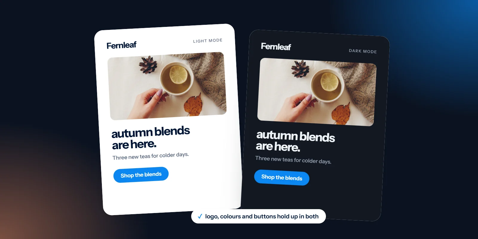
A lot of your subscribers read email in dark mode, often without thinking about it, because their phone switches over in the evening. Some inboxes leave your design alone, some flip only the light parts, and some invert almost everything. When you design emails for dark mode, the aim isn’t to control every pixel. It’s to make sure your logo, your message and your main button survive whichever version the reader happens to get.
What dark mode actually does to an email
There isn’t one dark mode. Broadly, inboxes do one of three things, and the same email can get different treatment in different apps:
No change: The app goes dark around your email, but the email keeps its own colours. A white newsletter becomes a bright rectangle in a dark inbox.
Partial inversion: Light backgrounds turn dark and dark text turns light, while areas that were already dark are mostly left alone.
Full inversion: Nearly every colour is flipped, including dark sections you designed on purpose. A deep navy band can come out pale.
Which one happens depends on the app, the device and how the email was put together, and it changes as apps update. So we design for all three rather than chasing one. The important detail is that photos and other images are generally left as they are while everything around them changes. That’s behind most dark mode problems.
Make your logo work on dark backgrounds
The classic failure is the logo. Most logos are dark artwork on a transparent background. On a white email that’s fine. When the background turns dark, a dark logo with nothing behind it simply disappears. Same email, same inbox, and your name has quietly vanished from the top.
Add a subtle outline or glow: A thin light stroke or soft halo around a dark logo keeps it visible on dark backgrounds and is barely noticeable on white.
Put it on a solid shape: A logo inside a white or brand-colour panel stays legible either way, because the panel travels with it.
Use a version that works on both: Many brands have a two-colour or mid-tone version that reads on light and dark. If yours doesn’t, it’s worth adding to your brand files. It’s one of the checks in test your logo in five places.
Check icons and small graphics too: Black social icons, dark arrows and thin line illustrations have exactly the same problem as logos.
Watch for white boxes: Product shots and graphics saved with a white background show up as bright rectangles on a dark email. Use transparent backgrounds, or design the white panel in on purpose with rounded corners and padding.
Keep important text live, not inside images
Text inside an image doesn’t change when the inbox goes dark. Dark words on a transparent image can vanish, and a light image box full of text stays glaring while everything around it dims. Live text, typed into the email rather than drawn into a picture, is adjusted by the inbox along with the rest, so it stays readable.
Live text also shows when images are blocked and can be read by screen readers, which we cover in design emails that still work with images off. If you want a headline over a photo, keep the photo free of words and set the headline in live text beneath it, or on a solid block of colour.
Choose colours that invert gently
Avoid pure black on pure white: Use a very dark grey or your darkest brand colour for text, and white or a soft off-white for the background. When an inbox inverts, it has gentler values to work with and the result is less harsh.
Check contrast in both modes: Body text needs a contrast ratio of at least 4.5:1 against its background; large headings and the edges of buttons need at least 3:1. Check your palette on light and on dark. Our guide to colour contrast and light grey text explains how.
Don’t rely on colour alone: If a sale price is only shown in red, that red may shift in dark mode. Pair colour with words: “Was £12, now £9”.
Give buttons a border: A button with a thin border in a contrasting shade keeps its shape even if the fill colour changes. The label stays live text.
Test brand colours on dark: Some brand colours that look calm on white glow uncomfortably on black, and some dark accents disappear. Pick a version of each that works on both.
Test in three inboxes before you send
You can’t fully predict dark mode from a design file, so test. At minimum, look at Apple Mail on an iPhone, the Gmail app and Outlook, with each device set to dark mode. Most email platforms let you send a test to yourself, and testing tools can show many inboxes side by side.
When you look, ask four questions. Can you see the logo? Can you read every line, including the small print? Does the main button still look like a button? Are there any bright white boxes around images? If all four answers are good, you’re ready to send. If not, the fix is usually one of the habits above, not a redesign.
Logo that works on dark, live text, off-black and off-white, and a quick test in three inboxes. That covers most of dark mode.
Design emails for dark mode from the template up
Dark mode is easiest to handle at the template stage, when colours, logo versions and image styles are decided once and reused in every send. That’s how we approach email template design: we design the light version, check how it holds up on dark, and supply logo and icon files that work on both.
Not sure how your emails look in dark mode? Send us one for a free email design review.