Design Emails That Still Work With Images Off
Not every inbox shows images. Design every email so it still makes sense when they don't load.

October 2026
By The Qivox team
Here’s a test worth doing before your next campaign: open it with images turned off. Some inboxes don’t load images until the reader allows it, and some workplaces block them by default. Outlook on desktop is the usual suspect. If your campaign is one big designed picture, an email with images off becomes a blank box with a small icon in the corner. Design for that moment first and every version of your email gets better, including the one with images on.
Why images don’t always load
Images in an email aren’t usually part of the message itself. They’re hosted online and fetched when the email is opened. Some inboxes wait for permission before fetching them, especially from senders the reader hasn’t marked as safe. Company IT settings can block them. A weak signal on a train can delay them. Some people simply switch images off to save data or for privacy.
And for anyone using a screen reader, images aren’t seen at all. They hear the alt text, if there is any. You can’t control any of this from your side. What you can control is whether the email still makes sense when it happens.
What breaks when an email is one image
Exporting the whole email as a single image from a design tool is tempting. It looks exactly like the mock-up, and it’s quick. But it puts everything important in the one place that might not show up.
The message: The headline, the offer, the dates and the prices are all pixels. With images off, none of them exist.
The button: A picture of a button is just a picture. If it doesn’t load, there’s nothing to tap, and the email has no way to send anyone to your website.
Accessibility: Screen readers can’t read words inside an image. Unless the alt text repeats them, the email is silent.
Dark mode: Text inside images doesn’t adapt when the inbox goes dark, which we cover in our guide to how to design emails for dark mode.
Inbox search: Customers can’t search their inbox for an offer that only exists inside an image. Live text can be found later.
Four habits for an email with images off
None of these make an email look plainer. They just decide which parts are pictures and which parts are words.
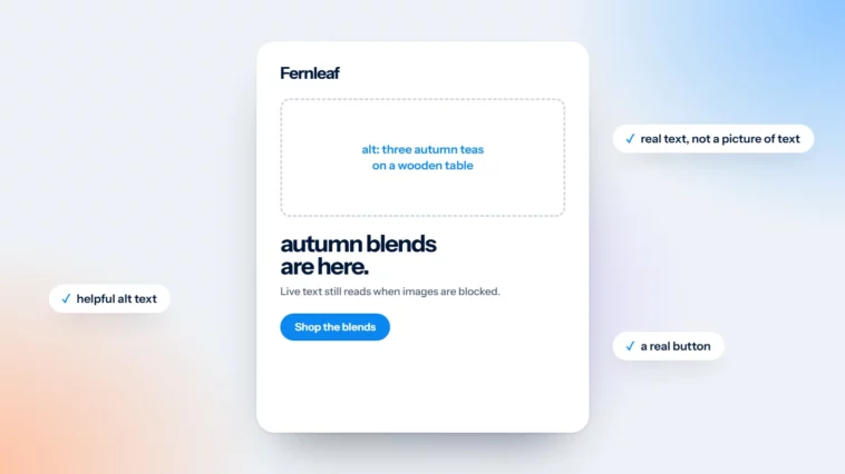
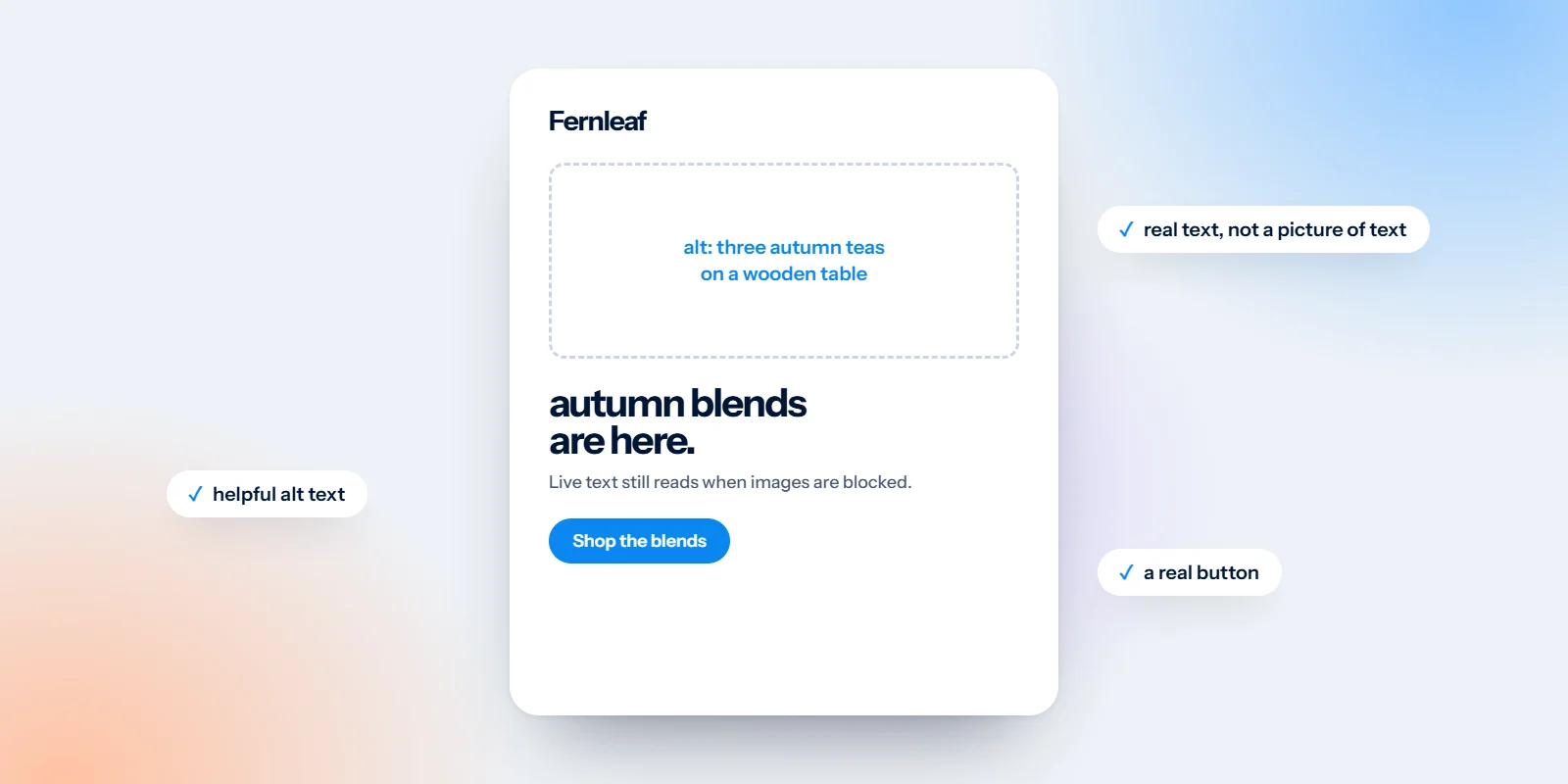
Headlines in live text: Set headlines, offers, dates and prices as real text in the email, styled with your brand colours. Use images for photos and illustrations, not for words.
Alt text on every image: Describe what matters about the image in a few words: “Spring sale, 20% off everything”, not “banner-final-v3”. Purely decorative images, such as dividers, should have empty alt text so screen readers skip them.
Background colours behind images: Give each image area a solid colour close to the image itself. The layout keeps its shape when images are blocked, and the alt text sits on a readable colour rather than a blank space.
Buttons made of live text: A button made from live text on a coloured block shows up whether images load or not. It’s also crisper on every screen and much easier to update for the next campaign.
The same email, with images off
Picture a spring sale email designed this way. With images off, the hero photo is replaced by a dark panel showing its alt text: “Spring sale, 20% off”. Underneath, the headline “Spring sale: 20% off everything” is live text. A short line explains the offer. A blue button reads “Shop the sale”.
Nothing important is lost except the photograph. When images load, the reader gets the full design. When they don’t, they still get the message and a clear way to act on it. That’s the whole goal.
If the email still makes sense with every image removed, it’s ready to send.
How to test your own emails
Turn images off in your own inbox: Most email apps have a setting to stop loading images or remote content automatically. Switch it off, send yourself a test and open it.
Read only the text: Ignore the layout and read from top to bottom. Do you know what the email is about, what’s on offer and what to do next?
Look hard at the first screen: The top of the email matters most. If the first screen with images off is a row of empty boxes, people may close it before they ever scroll.
Listen to it: Phones have a screen reader built in: VoiceOver on iPhone, TalkBack on Android. Listening to your email for a minute is quick and very revealing.
A few mistakes come up again and again: alt text left as the file name; white text placed over a photo with no background colour behind it, so it disappears on white when the image doesn’t load; and a main button that only exists inside a graphic. Each is quick to fix at the design stage and fiddly to fix later.
Templates designed for real inboxes
Designing for images off doesn’t mean designing plainly. It means planning which parts are photos and which are words, then making both look good. That’s how we work on email design: templates and campaigns that look considered with images on and still make sense with them off. For type that holds up in every inbox, see our guide to fonts in email design, and for the wider picture, our email design best practices.
Want a second pair of eyes? Send us a recent campaign for a free email design review.

