Email Preview Text Is Your Second Subject Line
The grey line under your subject decides whether people open. Most brands leave it to chance.

October 2026
By The Qivox team
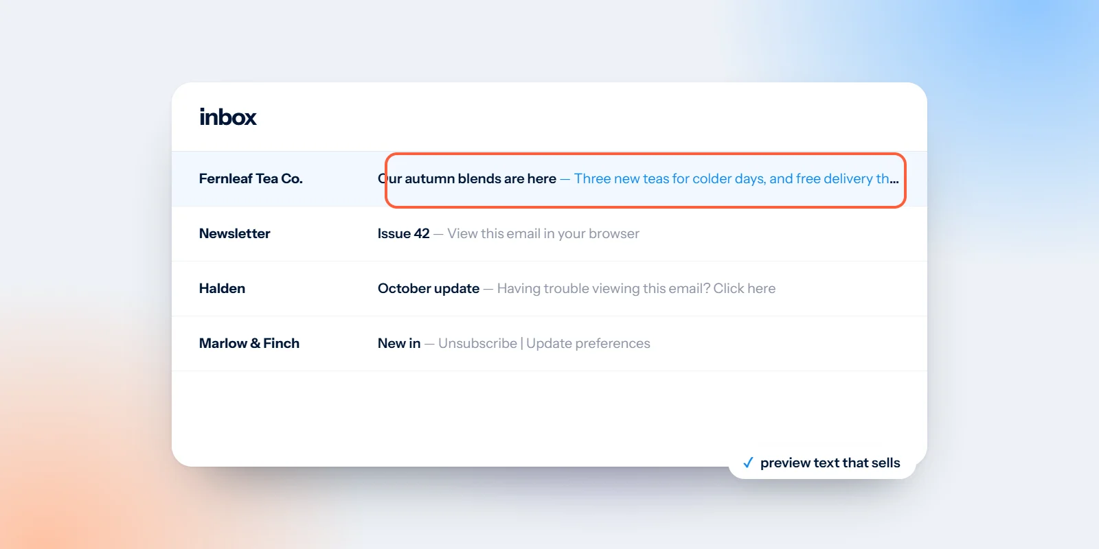
Open your inbox on your phone and look at any email. Under the sender and the subject there’s a short grey line of text. That’s the email preview text (sometimes called preheader text), and it’s one of the most underused spaces in email design. Leave it empty and the inbox fills it for you, usually with “View this email in your browser” or the first words of a disclaimer. Use it well and it works like a second subject line: one more reason to open, sitting right where people decide.
What preview text is and where it comes from
Before anyone opens an email, the inbox shows three things: who it’s from, the subject line and a snippet of text. That snippet is the preview text. If you don’t set it, most inboxes pull the first readable text from the email itself. In many templates that’s a “view in browser” link, the alt text of the header image, or a line of small print. None of it helps anyone decide to open.
How much of it shows depends on the app and the screen. A phone might show one or two short lines. A desktop inbox might squeeze it onto the same line as the subject, after a dash. So treat the first few words as the ones that matter most, and assume the end might get cut.
Aim for 40–90 characters: Long enough to say something useful, short enough that the important part survives on a phone. Put the key words at the start in case the end disappears.
Add to the subject, don’t repeat it: If the subject says “20% off autumn blends”, the preview shouldn’t say it again. Use it for the detail, the deadline or the feeling.
Lead with the reason to open: An offer, a date, an answer, a useful tip. Not “Dear customer”, and not your company name, which already shows as the sender.
Check it on a phone before you send: Send a test to yourself and look at the inbox list on your own phone. The editor preview rarely shows what the reader actually sees.
Write the subject and preview text as one sentence
The simplest way to get this right is to write the two together, like a headline and its subline. Read them aloud as a pair. Does the second half add something? Does it make the first half more interesting, or more urgent?
Here’s an example using an invented tea shop, Fernleaf Tea Co., that we use to show how this works. Before: the subject is “Fernleaf Newsletter – October” and the preview, which nobody set, reads “View this email in your browser. Dear Tea Lover, as the leaves…”. The reader learns that a newsletter exists. Nothing more.
After: the subject is “20% off autumn blends, until Sunday” and the preview is “Smoky, spiced and properly warming. Three blends are back.” In two short lines the reader knows what’s on offer, how long it lasts and why they might care. We walk through the rest of that email in our newsletter review example.
Subject plus preview text is one message. Write them together, then read them as a pair.
Preview text patterns that work for small businesses
The deadline: The subject names the offer, the preview says when it ends and removes a worry. “Ends Sunday at midnight. No voucher needed.”
The detail: The subject names the thing, the preview makes it specific. Subject: “Our spring menu is here”. Preview: “Wild garlic soup, rhubarb tart and two new vegan mains.”
The answer: Useful for advice newsletters. The subject asks a question, the preview hints at how simple the answer is. “Three checks you can do in ten minutes.”
The personal note: For a small shop or studio, a plain human line often beats a slogan. “A short note from the shop, and what’s new on the shelves.”
The practical reminder: For events and bookings, answer the question people will have. “Doors open at 7pm. Here’s where to park.”
Template details that affect what the inbox shows
Preview text is written, but it’s also a design job, because the layout of the template decides what the inbox picks up. A few things to look at in yours:
Plan a preview line in every template: Good templates include a dedicated preview text field at the very top, read by the inbox but not shown in the email itself. When we design templates, we mark it in the design file so it never gets forgotten on a busy day.
Move utility links out of first place: If the first text in your email is “view in browser” or “update your preferences”, it can end up in the preview. Put those links after the preview line or in the footer.
Watch the header image’s alt text: If the email opens with an image and no preview text is set, some inboxes read the image’s alt text instead. Write it as if it might be seen there.
Make the first screen deliver the promise: If the preview mentions 20% off, the offer should be the first thing people see when they open, in live text, not halfway down.
Go easy on emojis: One can add warmth, but emojis look different across devices, and screen readers read their names aloud. Use one at most, and never instead of words.
Common email preview text mistakes
The ones we see most are simple to fix. Leaving the field blank, so the inbox grabs whatever comes first. Repeating the subject word for word, which wastes the space. Writing a long sentence that only makes sense once the last word appears, which phones cut off. And promising something in the preview that the email doesn’t deliver, which teaches people to ignore you next time.
It’s also worth checking older automated emails, such as welcome series, order confirmations and booking reminders. They were often set up once and never revisited, and they’re the emails your customers see most.
Make every send count
Preview text is a small thing, but it sits next to every email you send. If you’d like templates that make space for it, and campaigns where the subject, preview and first screen all tell the same story, have a look at our email design service. If your emails are also read late in the evening, our guide on how to design emails for dark mode covers the next thing worth checking.
Not sure how your emails look in the inbox? Send us a recent campaign for a free email design review.

