Fonts in Email Design: What Works in Every Inbox
Your brand font won't show everywhere. Choose the fallback on purpose and your emails look right anyway.

October 2026
By The Qivox team
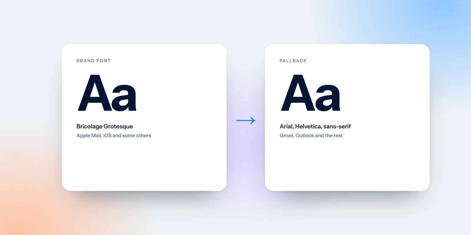
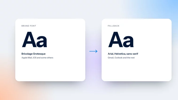
Your brand font looks great in the design file. Then the email lands in Gmail and it’s gone, replaced by something you didn’t choose. Fonts in email design work differently from fonts on a website: custom fonts only show in some inboxes, and everyone else sees a fallback. That isn’t a reason to give up on brand type. It’s a reason to choose the fallback as carefully as the font itself, so your emails look right everywhere, not just in the inbox you happen to use.
Fonts in email design: where custom fonts load
Custom web fonts load in Apple Mail, including Mail on iPhone and iPad, and in a few other apps. They don’t load in Gmail or in Outlook on Windows. For many mailing lists, that’s a large share of readers. In those inboxes, the email moves on to the next font in its list instead.
So for a good part of your audience, your fallback font is your email font. That’s why we treat it as a design decision rather than a technical detail, and why we always look at an email design in its fallback before calling it finished.
Always specify a fallback stack
A font stack is the ordered list of fonts an email asks for. The inbox uses the first one it has. A typical stack starts with your brand font, then a widely installed font with a similar feel, then a generic family such as “any sans-serif”. These are the dependable choices for that middle step:
Arial: Installed on almost every computer and phone. A sensible fallback for most modern sans-serif brand fonts.
Helvetica: Standard on Apple devices and a close cousin of Arial. Often listed alongside it.
Georgia: A sturdy, readable serif designed for screens. Good for brands with a serif or a more traditional voice.
Verdana: Wide and very legible at small sizes. It takes more space, so allow for fewer words per line.
Trebuchet MS: A sans-serif with a little more personality. Useful for friendly, informal brands.
You can also use these as the main font when the design allows. A well-set email in Georgia or Arial, with good spacing and a clear hierarchy, looks far better than a brand font that only appears for some readers.
Pick a fallback that matches width and height
Two fonts at the same size can look very different. A narrow brand font swapped for a wide fallback can push a headline from one line to three, or turn a neat button label into two awkward lines. Choose a fallback with a similar width and x-height (the height of the lowercase letters), then check your key layouts in both.
Test your longest headline: Set it in the fallback at mobile width and see where it breaks. If it wraps badly, shorten the copy or adjust the size.
Check every button label: Labels should stay on one line in both fonts. A button that wraps looks broken.
Leave a little slack: Give headings and buttons some breathing room, so a slightly wider font doesn’t push the layout out of shape.
The Outlook trap
Outlook on Windows has a habit of ignoring the rest of the stack when it doesn’t recognise the first font, and dropping straight to Times New Roman. A clean, modern email suddenly arrives looking like an old office memo. The fix is an Outlook-specific fallback set alongside the main one, so Outlook knows exactly what to use.
In our design files we spell out the fallback for every text style, including the Outlook one, so nothing is left to chance when the email is put together in your platform. If you’ve ever seen your emails arrive in Times New Roman, this is almost always why.
Write down the fallback for every text style. If nobody chooses it, Outlook will choose for you.
Make type readable on a phone
Body text at 16px where you can: 14px is a common minimum for email body text; 16px is more comfortable on a phone. Keep line height around 1.4 to 1.6 and paragraphs short.
Headlines in live text: It’s tempting to export headlines as images to keep the brand font. Keep them live, so they show when images are blocked, adapt in dark mode and can be read by screen readers. More in design emails that still work with images off.
Brand font in images, sparingly: A hero image can carry a short line in your brand font, as long as the alt text says the same thing and the key message is repeated in live text.
Two typefaces at most: One for headings, one for body, often from the same family. Our note on why two typefaces are enough applies to email too.
Enough contrast: Thin weights and light grey text get harder to read on small screens. Body text should meet a contrast ratio of at least 4.5:1 against its background.
Emails that look right everywhere
We design emails for real inboxes, not just for the design file. Our email design work includes type styles with fallbacks chosen and tested, so your campaigns stay on brand in Apple Mail, Gmail and Outlook alike. If you’re also tidying up your templates, our guide to Gmail clipping covers another inbox limit worth knowing.
Want to see how your emails look in Gmail and Outlook? Send one for a free email design review.