7 Signs Your Website Is Losing You Customers
Seven quiet problems that send visitors elsewhere, and how to check for each one this week.

October 2026
By The Qivox team
Most websites don’t fail loudly. Nobody emails to say they left. They just tap back and choose someone else. If enquiries have gone quiet while your reputation is good, there’s a fair chance you have a website losing customers without telling you. Below are the seven signs we see most often when we review small business sites, with a simple way to check each one and a fix you can start on today.
Signs 1 and 2: slow and awkward on a phone
Most people will meet your business on a phone, often on mobile data, often in a hurry. That is where your site needs to work best, and it’s where it usually works worst.
1. It’s slow on mobile: If the main content takes more than a few seconds to appear, many visitors leave before they see it. Run your homepage through Google’s free PageSpeed Insights and look at Largest Contentful Paint: Google treats 2.5 seconds or less as good. The usual culprit is oversized images. Resize them to the size they’re shown at and compress them before upload.
2. It’s hard to use with one hand: Tiny text, buttons squeezed together and a menu that hides the one thing people came for. Keep body text at around 16px or larger, and give buttons room. WCAG 2.2 sets a minimum target size of 24 by 24 pixels; a comfortable thumb target is closer to 44. Our guide to designing for thumbs covers this in detail.
Sign 3: there’s no clear next step
Every page should have one obvious action: call, book, buy or ask for a quote. When a page offers five links of equal weight, or a button that says “Submit” or “Read more”, people hesitate. Hesitation on a phone usually means leaving.
The check is quick. Open your three most visited pages and ask what you want a visitor to do next. If you can’t point to one button that stands out, that’s the fix. Make one button filled and high contrast, label it with the outcome (“Book a consultation”, “Get a quote”), and turn everything else into a quieter text link. We explain why in one primary button per page.
Sign 4: it looks like everyone else
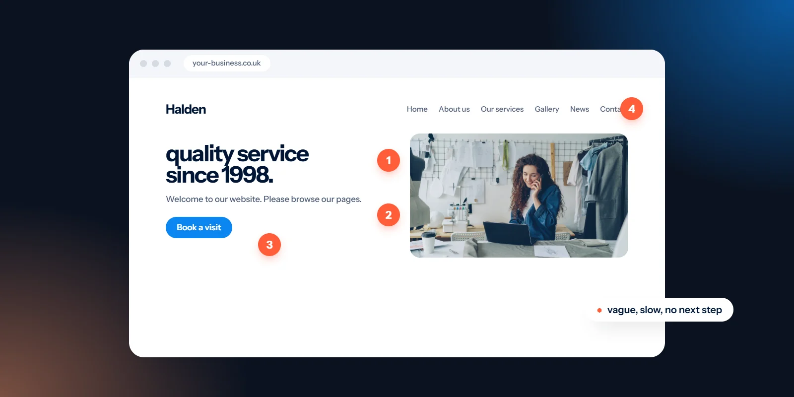
A template look, a stock photo of a handshake and a headline like “Welcome to our website” give people nothing to remember. If your site could belong to any competitor in your area, it won’t help anyone choose you.
Swap the stock photos: Use real photos of your team, your premises and your work. They don’t need to be perfect, just well lit and honest. Visitors notice the difference straight away.
Rewrite the headline: Say what you do, who it’s for and where, in one sentence. “Calm, gentle dentistry in Clifton” works harder than “Excellence in every detail”.
Use your brand properly: Your own colours, typefaces and tone, applied the same way on every page. Consistency reads as care, and care reads as trustworthy.
Signs 5 to 7: stale content, missing proof, hidden basics
These three are about trust. Each one on its own is small. Together they make a business look closed, careless or expensive.
5. Out-of-date content: Last year’s prices, a news page that stopped in 2023, a Christmas offer in spring, a broken link in the footer. Visitors read old content as a sign that nobody is minding the shop. Delete what you can’t keep current, and put a reminder in your diary to check prices and opening hours every quarter.
6. No proof: No reviews, no examples of work, no faces. People want to see that others have chosen you and been happy. Add a short line of proof near the top of the homepage, such as your review rating, and link to a page of real work.
7. The basics are hard to find: Prices, location, opening hours and a phone number are the first things many people look for. If they’re buried three clicks deep, people assume the worst. Even a “from” price helps. Put contact details in the header or footer of every page.
Is your website losing customers? A one-hour test
You don’t need analytics expertise to spot most of these. Set aside an hour, pick up your phone and work through this in order:
Load it on mobile data: Turn off Wi-Fi and open your homepage. Count the seconds until you can read the headline.
Try the main task: Book, buy, call or enquire using one thumb. Note every moment you have to zoom, scroll back or guess.
Ask a stranger: Show a friend who doesn’t know your business the homepage for five seconds. Can they say what you do and where?
Hunt for the basics: Time how long it takes to find a price, your address and your phone number.
Click everything: Every menu item, footer link and button. Write down anything broken, empty or out of date.
If you ticked two or more of the seven signs, start with the fixes that take an hour or an afternoon. Our website redesign checklist lists the quick wins worth trying before you spend money on a new site.
Where to go from here
Some of these fixes are a morning’s work. Others, like a slow theme or a structure that has grown messy over years, point to something bigger. If that’s where you are, our website design and development service builds fast, clear sites that are easy to use on a phone and easy for you to keep up to date.
Not sure which signs apply to you? Send us your link for a free website review: a scorecard, your top five fixes and a quick concept, with no sales call.

