Website Review Example: A Dental Practice Homepage
An invented practice, real problems: how we score a homepage, mark it up and fix the first screen.

October 2026
By The Qivox team
This is a website review example for Harbour & Co. Dental, a family practice in Clifton, Bristol. To be clear from the start: the practice is invented. It isn’t a client and the site doesn’t exist. We built it to show how a review works, using problems we see all the time on real small business sites. If you run a practice, a salon, a clinic or any business that takes bookings, you’ll probably recognise a few of them.
The practice and the verdict
Imagine a well-liked practice with good reviews and a loyal list of patients, but a website that hasn’t changed in years. The homepage has a blue utility bar with phone, email and opening hours, a logo, an eight-item menu in capitals, a rotating photo slider and three columns headed Our Mission, Our Values and Our Promise.
Some things are working. The practice name and phone number are clear, the page structure is logical, and the content is up to date and quick to load. Our verdict: a well-liked practice with a website that undersells it. The structure is fine, but the first screen needs a clear message, one obvious way to book and warmer photography.
Visual hierarchy: 2 out of 5: Nothing tells a new patient where to look first. Every line is centred and the same weight.
Calls to action: 1 out of 5: There’s no clear way to book from the homepage.
Interface and layout: 3 out of 5: A tidy grid, let down by a cluttered header and an old-style slider.
User experience: 2 out of 5: Fees and booking are hidden behind the menu.
Brand and imagery: 3 out of 5: A friendly name, let down by cold stock photos.
Mobile: 2 out of 5: Text and a cookie bar push everything useful off the first screen. Total: 13 out of 30.
Five problems on the first screen
When we mark up a page, we number each problem on the screenshot and explain it underneath. Here are the five we’d flag on this homepage.
1. The headline says hello. “Welcome to Harbour & Co. Dental” tells a visitor the name, which they already know from the logo. It doesn’t say what kind of practice it is, who it’s for or where. 2. Two buttons, same weight. “Read more” and “Contact us” sit side by side as identical outlines, and neither says “Book”. Booking is three clicks away. 3. Eight menu items in capitals. Plus the utility bar, that’s a lot to read before anything useful. 4. An empty treatment chair. The hero photo shows equipment, which is the least reassuring thing a nervous patient can see. 5. Mission, values, promise. All three columns talk about the practice. There are no fees, no reviews and no faces.
The fixes, in order of impact
Every review ranks the fixes by impact and gives an honest note on effort. Here, the top three are high impact and low effort, which is common.
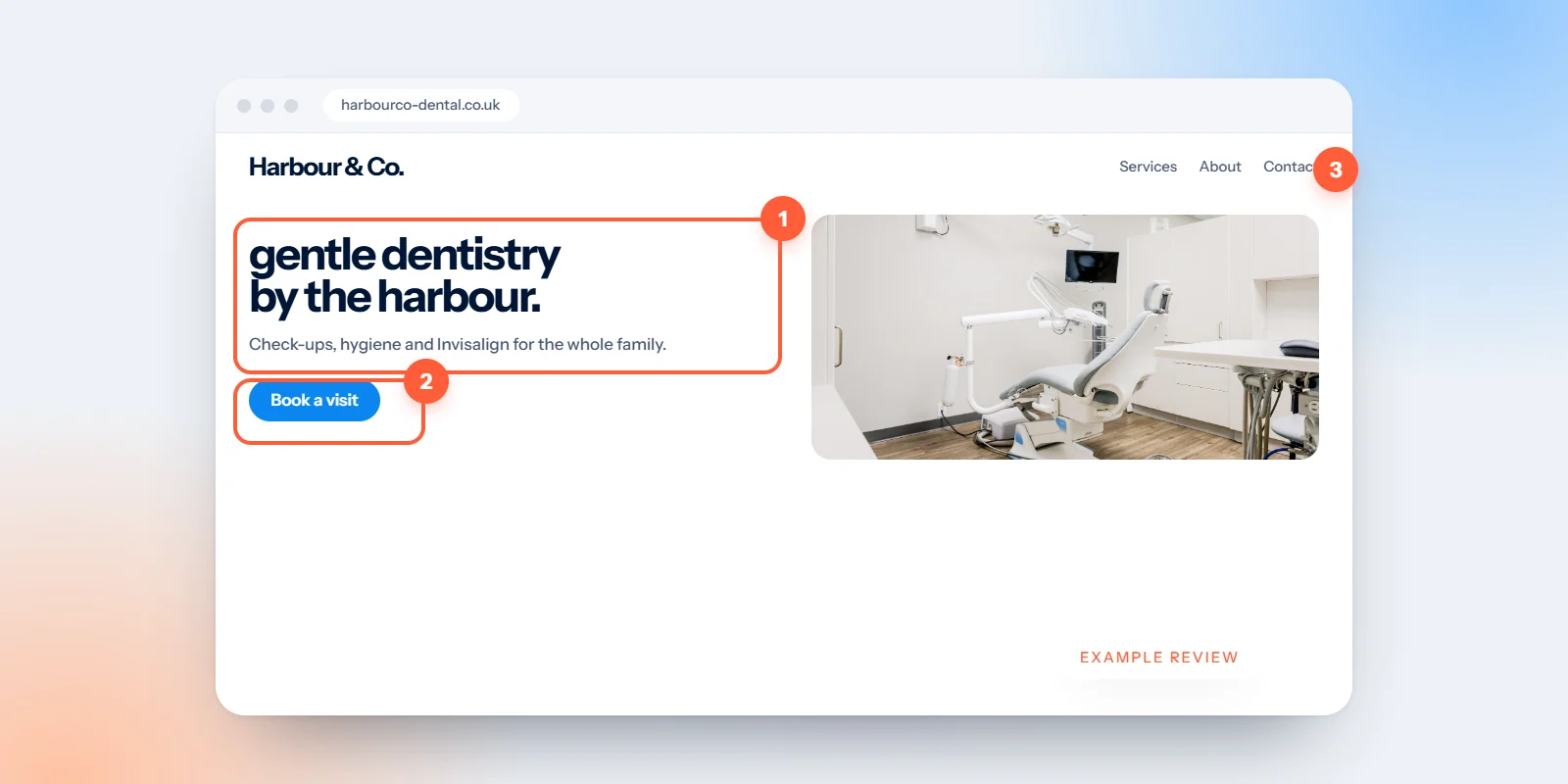
Lead with what you do and where: “Calm, gentle dentistry for the whole family” with “Clifton, Bristol · NHS & private” just above. One left-aligned headline, then a line of detail: new patients welcome, same-week appointments, clear fees. Our guide to homepage headlines explains the formula.
One primary button: Book an appointment: Filled, high contrast, in the hero and the header. “See our fees” becomes a quiet text link beside it. Read why in one primary button per page.
Show people, not equipment: A dentist and patient in warm natural light, mid-conversation. And drop the auto-rotating slider: one strong photo does more than five that move.
Cut the menu to four items: Treatments, Fees, About, Contact. Opening times move to the footer, and the phone number sits beside the booking button.
Bring reviews and fees above the fold: A line such as “4.9 stars from 380 Google reviews” and “check-up from £55” answer two of the first questions a new patient has.
On a phone, where most patients find you
On mobile, the problems get worse. Today, the headline sits on top of a photo, both buttons are below the fold and a cookie bar covers half the screen. A visitor sees a logo, a welcome message and a block of legal text.
In the recommended version, the headline, one large “Book an appointment” button and the review rating all fit on the first screen. A slim sticky bar at the bottom keeps “Call” and “Book online” within thumb’s reach as the patient scrolls. The cookie notice becomes a small, polite banner rather than a wall. Our mobile website tips cover the same principles for any business.
What this website review example means for you
You don’t need to run a dental practice for this to apply. Take ten minutes with your own homepage and ask the same five questions. Does the headline say what you do and where? Is there one button that clearly books, buys or calls? Do the photos show people and real work? Can someone read the menu in a glance? Are prices and reviews visible without hunting? Each no is a fix, and most of them are cheaper than they look.
If you’d like to know what goes into each score, read what we look at in a website review. If the fixes add up to more than a few edits, our website design and development service can redesign the pages that matter most.
Want the same for your site? Send us your link for a free website review: your scorecard, top five fixes and a quick concept of the first screen.

