Brand Review Example: A Neighbourhood Bakery
Six touchpoints, four brands. How we would review an invented bakery, and the simple system that fixes it.

October 2026
By The Qivox team
The easiest way to explain a brand review is to show one. This brand review example looks at Pellow Bakery, a neighbourhood bakery in Bath. To be clear from the start: Pellow is an invented business, not a client. We made it up to show how a review works, using problems we see all the time in real small brands. The bread is great, the story is genuine and the photos are lovely. But across six touchpoints, Pellow looks like four different businesses. Here is what we looked at, what we found, and how we would fix it.
What we looked at
A brand review starts by putting everything side by side. Problems that are invisible one piece at a time become obvious when the website sits next to the paper bag. For Pellow, we gathered six touchpoints: the website, the Instagram feed, the paper bag, the shop sign, the menu board and the loyalty card. These are the places a regular customer would see in a normal month, so they are the places the brand is really built.
What we found
We marked up each touchpoint and grouped the issues into five problems. None of them is unusual. Most businesses that have grown over a few decades collect them naturally, one decision at a time.
1 · Four names and logos: Depending on where you look, the bakery is Pellow’s in a looping script, PB in a heavy poster font, pellow bakery in a rounded Comic Sans-style face, or Pellow & Sons in gold capitals. A customer could reasonably wonder whether these are four shops.
2 · No colour palette: Pink online, yellow on Instagram, purple on the cards and green on the shopfront. Nothing connects them.
3 · Five typefaces: Each touchpoint has its own fonts, and some have two. One of them is a Comic Sans-style face that undercuts the quality of the bread.
4 · Mixed photo filters: The photos themselves are good, but each has a different filter: warm, cool, faded, high contrast. The feed looks like it comes from several accounts.
5 · A generic message: The main line is a version of fresh every morning, with two exclamation marks. Every bakery says that. It tells the customer nothing about why Pellow is different.
Fix 1: one name, one logo
The first decision is the simplest and the most important: choose one name. We would recommend Pellow. It is short, distinctive and already the common thread in every version. The & Sons and the initials can go.
The new logo pairs a simple loaf mark with the name set in DM Serif Display, in warm cream on a deep brown. It is calm and confident, and it works in every place we test a logo: as a circle avatar, in one colour on a paper bag, reversed on a dark sign, over a photo and tiny as a browser icon. Our guide on how to test your logo in five places explains each of those checks.
Fix 2: four colours, two typefaces
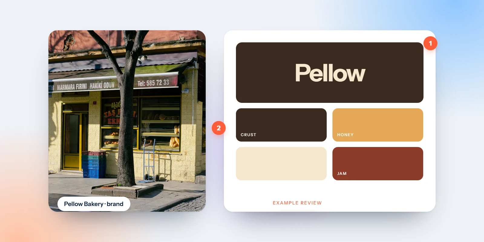
Next, we replace the mix of pinks, yellows, purples and greens with a palette taken from the bakery itself. Each colour has a clear role, so whoever makes the next menu or post knows exactly what to use.
Crust · #3B2417: A deep brown for the logo, headlines and text. It replaces black and feels warmer.
Flour · #F3EADB: A warm cream for backgrounds, bags and the loyalty card. This is the dominant colour.
Oven · #D9622B: A baked orange accent, kept for prices, offers and buttons on the website.
Sage · #8A9A7B: A soft green for surfaces and secondary details, which also nods to the old shopfront.
Two typefaces: DM Serif Display for headlines and DM Sans for everything else. The five old fonts go. Our note on why two typefaces are enough explains the thinking.
Fix 3: one photo style and a message only Pellow can say
The photos need one consistent treatment: the same warm, natural light, the same slightly lifted shadows, and one simple rule about subjects, such as hands, dough and crust rather than empty shelves. Pick one edit, save it as a preset and use it on every photo from now on.
Then the message. Instead of a line every bakery could use, we would write one only Pellow can say: Slow-proved sourdough, baked in Bath since 1987. It names the product, the method, the place and the history in eight words. Our article on how to say what only you can say shows how to find a line like that for your own business.
The goal is not a fancier brand. It is one bakery, recognisable everywhere.
Run this review on your own brand
Collect six touchpoints: Website, social feed, packaging, signage, printed material and anything you hand to customers.
Lay them out together: One table or one screen. Look for different names, colours and fonts.
Write down the five biggest problems: Not every small difference. Focus on the ones a customer would notice.
Fix the name and logo first: Everything else follows from them. Then colour and type, then photos and words.
If you would like us to do this for you, our brand identity work covers the full refresh, from one logo to a palette, type, templates and guidelines that keep it all together.
Does your brand look like one business? Request a free brand review: a short PDF with your scorecard, top 5 fixes and a quick concept.

