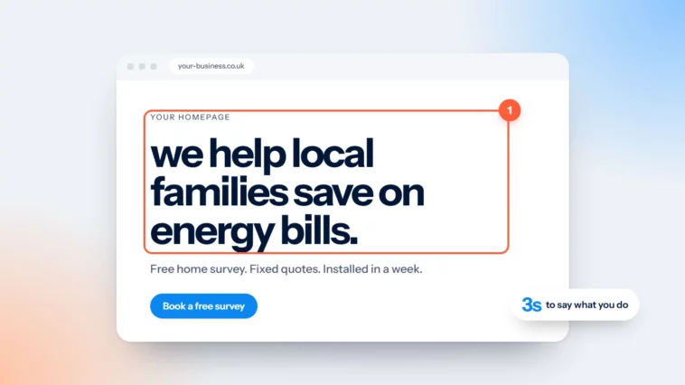
Your Homepage Headline Has Three Seconds
One sentence that says what you do, who it’s for and where. The rest of the page can do the explaining.

October 2026
By The Qivox team
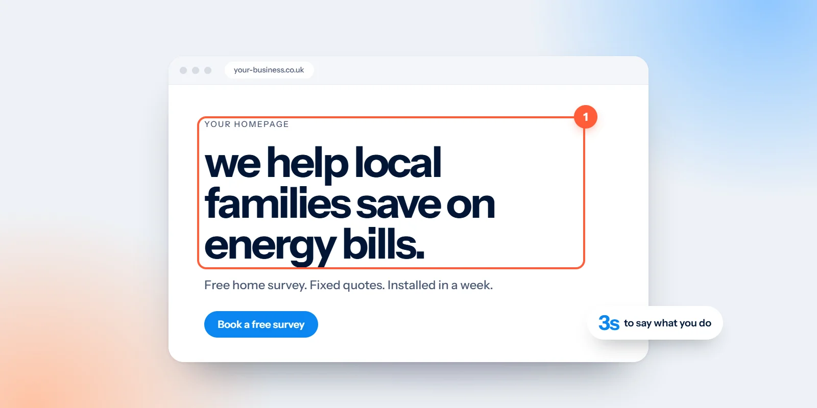
Someone taps a link and lands on your site. Before they scroll, before they read a word of your About page, they glance at the big line at the top and decide whether they’re in the right place. Your homepage headline has roughly three seconds to do that job. It’s a rule of thumb rather than a lab figure, but anyone who has watched a friend use their phone knows it’s about right. This guide gives you a test, a formula and a handful of fixes you can make this afternoon.
The stranger test for your homepage headline
Read your headline out loud to someone who doesn’t know your business. A neighbour, a friend’s teenager, anyone outside your industry. Then ask them three questions.
What do we do?: If they hesitate or guess, the headline is describing a feeling, not a service.
Who is it for?: Homeowners, small charities, new parents, creative studios. If they can’t say, you’re talking to everyone, which usually means no one hears you.
Where are we?: For a local business this matters a lot. A visitor from the wrong city will leave, and the right one wants reassurance that you’re close.
What should I do next?: This one belongs to the button, not the headline, but it’s worth asking. If they don’t know, see our note on using one primary button per page.
If they get the first three right without help, your headline is working. If not, it needs a rewrite, and that’s good news, because it’s one of the cheapest changes you can make to a website.
A simple formula: what, who, where
Most clear headlines follow the same shape: [what you do] for [who], in [where]. You don’t need all three parts every time. An online shop that sells nationwide can drop the place. A specialist with one type of customer can lean on the “who”. But starting from the full formula stops you writing something vague.
Calm, gentle dentistry in Clifton.: What, a hint of who (nervous patients), and where. Seven words.
Small-batch coffee, roasted in Bath.: Product, the thing that makes it different, and the place it comes from.
Bookkeeping for creative studios.: No place needed. The audience is the selling point.
Wedding flowers for Cotswold venues.: Service, occasion and area in one line. A couple planning a wedding knows instantly.
Notice what these have in common. They use plain nouns a customer would type into a search bar. They avoid adjectives that any competitor could claim. And they’re short enough to read on a phone without wrapping onto four lines.
Headlines to retire
Some lines turn up on thousands of small business websites. They feel safe because everyone uses them, which is exactly the problem.
“Welcome to our website”: The visitor already knows they’re on your website. This spends your best space saying nothing.
“Excellence in every detail”: A promise every business makes. It doesn’t tell anyone what the details are, or what they’re for.
“Your trusted partner”: Partner in what? Trust is earned by proof further down the page, not claimed in the headline.
Your company name on its own: Your logo already says who you are. The headline should say what you do.
If you’re attached to a line like this, keep it as a smaller tagline elsewhere. Just don’t let it sit in the spot where a new visitor makes up their mind. For more on finding words that belong only to you, read say what only you can say.
Add one line of proof underneath
A clear headline tells people what you do. The line underneath, sometimes called the subheading, gives them a reason to believe you. Keep it to one sentence and make it something you can back up.
A promise you keep works well: “Same-week appointments, clear fees, no surprises”, as long as it’s true every week. So does a real rating, quoted with its actual score and the public platform it comes from. A concrete detail such as “Family-run since 1998” or “Roasted every Tuesday” is more convincing than any adjective. Or name the type of customer you help, rather than a row of logos you don’t have permission to use.
One sentence, three answers. What, who and where. The rest of the page can do the explaining.
Check how it looks on a phone
Most first visits to a small business site happen on a phone, so judge your headline there, not on a big desktop monitor. Open your homepage on your own mobile and look at the first screen without scrolling.
Can you read it in one glance?: If it wraps onto four or five lines, cut words. Aim for something that fits in two or three lines at a comfortable size.
Is it competing with a photo?: Text over a busy image is hard to read. Add a solid or tinted panel behind it, or move the text above the picture. Our guide to colour contrast explains why.
Is it real text?: A headline baked into an image can’t be read by search engines or screen readers, and it often blurs on high-resolution screens. Ask your web designer to make it live text and the page’s main heading.
Is the button visible too?: Ideally the headline, the proof line and your main button all appear on the first screen.
Then try the headline on a second page. Your service pages deserve the same treatment, because many visitors arrive there first from search, not through the homepage.
Where to go from here
Rewrite your headline using the formula, run the stranger test again, and change it on your site today. It costs nothing and you’ll know quickly whether it reads better. If you’d like the whole homepage to work this hard, that’s what our website design and development work is for: clear words first, then a design that makes them easy to read.
Not sure your headline passes? Ask for a free website review and we’ll tell you what a stranger sees in those first three seconds.

