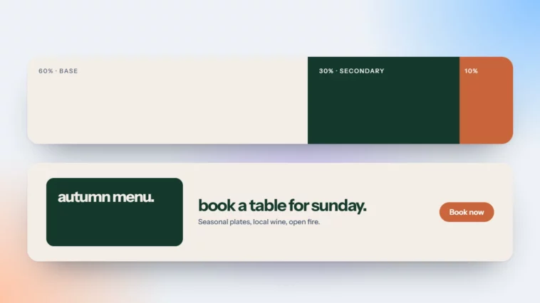
The 60-30-10 Colour Rule for Brands and Websites
A dominant colour, a secondary and one accent. A simple rule that keeps any palette calm and clear.

October 2026
By The Qivox team
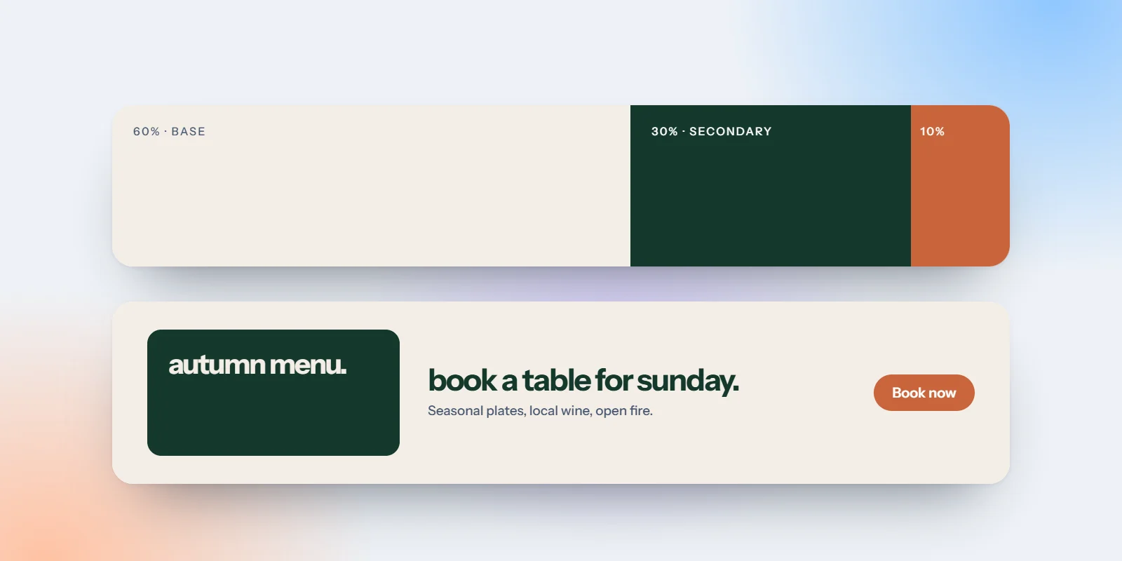
Most brand palettes do not fail because the colours are wrong. They fail because every colour is used at once, in roughly equal amounts, so nothing stands out and the eye has nowhere to rest. The 60-30-10 colour rule fixes that with one simple idea: give each colour a share and a job. About 60% of what people see is a dominant colour, 30% a secondary colour, and 10% an accent. The rule is borrowed from interior design, and it works just as well on a website, a menu or a social feed. Here is how it works, a real example, and how to apply it to your own brand this week.
What the 60-30-10 colour rule means
The percentages are a guide, not a measurement. Nobody counts pixels. The point is proportion: one colour clearly leads, one supports, and one is kept rare enough to mean something.
60% dominant: Backgrounds and large areas. This colour sets the mood of everything, so it is usually a quiet one: a dark navy, an off-white, a soft neutral.
30% secondary: Cards, panels, surfaces and supporting text. It adds structure and stops the dominant colour feeling flat.
10% accent: Buttons, links, highlights and the one thing you want people to click. Because it is rare, it draws the eye wherever it appears.
A real example: Delta Luxury Transport
When we designed the identity and website for Delta Luxury Transport, an Athens chauffeur service, the palette was built on exactly this rule. Night (#010F17) is the dominant colour, used for backgrounds and large areas, which gives the brand its calm, premium feel. Mist (#EDEDED) and Slate (#69727D) are the secondary colours, for light surfaces and supporting text. Amber (#FFBF00) is the accent, used for the crown in the logo and for the buttons. Night everywhere, Mist for surfaces, Amber only where you act.
The result is that the booking button is the brightest thing on every page, without needing to be large or loud. You can see the whole system in the Delta Luxury Transport case study.
If your accent colour is everywhere, it is not an accent any more. Keep it for the things you want clicked.
How to apply it to your website
You can test the rule on your current site without changing your brand colours. Work through these steps with your homepage open.
List your colours: Write down every colour on the page, including greys. If there are more than five or six, some of them are probably accidents.
Choose the dominant: Pick the colour that should fill most of the page. For most small businesses, a light neutral is the easiest choice for long reading.
Choose the secondary: Pick one colour for cards, section backgrounds and footers. It should be clearly different from the dominant but not compete with it.
Reserve the accent: Pick one accent and use it only for buttons and key links. Remove it from decorative lines, icons and headings.
Match it to your main action: Make sure the accent sits on the action that matters most, such as Book, Buy or Get a quote. Our guide to one primary button per page explains why that matters.
Using the rule beyond the website
The same proportions work anywhere your brand appears, and using them consistently is what makes a brand recognisable across channels.
Social posts: Keep most posts on your dominant or secondary colour and use the accent for a single highlight, such as a date or a price. Your grid will look like one brand at a glance.
Print: On menus, flyers and cards, use the dominant colour for the background or the paper, the secondary for panels, and the accent for one detail.
Email designs: A light dominant background, a secondary panel for each section and an accent button work well in the inbox, and are easier to check in dark mode.
Signage and packaging: The accent often works best as a small detail, such as a stripe, a sticker or a seal, rather than covering the whole surface.
Common mistakes to avoid
The rule is simple, but a few habits undo it quickly.
Two accents competing: A red button and an orange banner on the same page split attention. Choose one accent and stick to it.
Accent used for decoration: Headings, borders and icons in the accent colour make it less useful for buttons. Keep decoration in the secondary colour.
Forgetting contrast: Colours need enough contrast to be readable. The usual guideline, WCAG AA, asks for 4.5:1 for body text and 3:1 for large text and interface elements. Our guide to colour contrast explains how to check.
Treating it as strict maths: If a photo-heavy page shifts the balance, that is fine. The proportion matters more than the exact numbers.
Building a palette that works
Every palette we create as part of a brand identity comes with clear roles: which colour is dominant, which is secondary, which is the accent, and which combinations are safe for text. It is a small piece of the guidelines, and one of the most useful. If you would like to know whether your current colours are working for you, we can take a look.
Try the rule on your brand tonight, then get a free brand review for a designer’s view on your colour, type and logo.