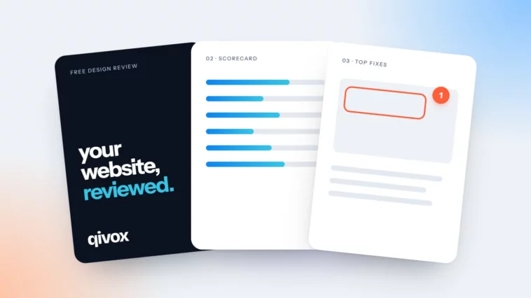
Inside a Free Design Review: What You Get and How It Works
Seven pages, five working days, no sales call. A page-by-page look at what we send back.

October 2026
By The Qivox team
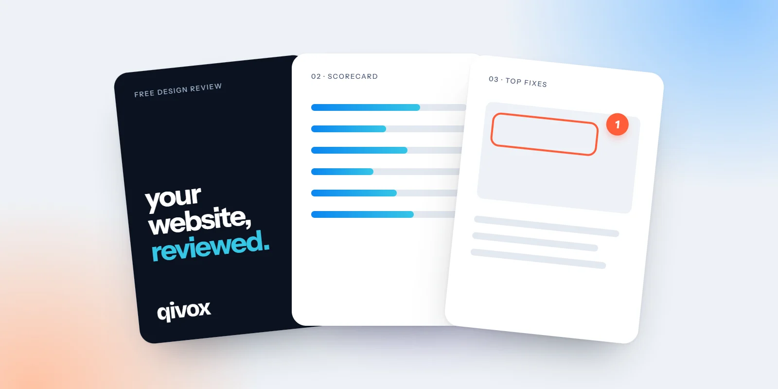
We offer a free design review of your website, an email campaign or your brand. People reasonably ask what that actually means. Is it an automated report? A sales pitch in disguise? A list of everything that is wrong? It is none of those. It is a short PDF, written by a designer who has looked at your work properly, that tells you what is working, what is getting in the way and the five changes we would make first. This article walks through how it works and what is on each of the seven pages, so you know exactly what to expect.
How a free design review works
There are four steps and nothing to sign.
01 · Send your link: Fill in a short form with your website address, a recent email or details of your brand. We do not need logins, passwords or access to anything.
02 · We review it: A designer looks at your work the way your customers see it: on desktop and on a phone, in normal conditions, not in a perfect preview.
03 · Your PDF arrives: A short PDF lands in your inbox, usually within five working days.
04 · You decide: Use the fixes yourself, pass them to your own designer, or ask us for a quote. There is no sales call and no obligation.
Pages one to four: where you stand
The first half of the review is about the current state of your work: an honest score, the evidence behind it, and what to do first.
01 · Cover: A simple front page for the PDF, so it is easy to file, forward or share with a partner or your team.
02 · Your scorecard: A score out of 5 across six design areas. For a website, those are visual hierarchy, calls to action, interface and layout, user experience, brand and imagery, and mobile. The total gives you a quick sense of where you stand.
03 · Your pages, marked up: Screenshots of your work with numbered notes drawn on top, so you can see exactly which heading, button or photo we mean. This is often the most useful page, because it points at real things rather than general advice.
04 · Top 5 fixes: The five changes we would make first, ranked by impact. Each one is short and specific, such as leading with what you do and where, or cutting the menu to four items.
If you would like more detail on the six website areas, our article on what we look at in a website review explains each one and the questions behind it.
Pages five to seven: what it could look like
The second half moves from diagnosis to direction. It is there to help you picture the result, not to sell you a redesign.
05 · A quick concept: A rough visual of your page or design with the top fixes applied. It is not a finished design, but it shows how the changes work together and makes them easier to explain to others.
06 · Mobile: A separate look at your work on a phone, because that is where most people will see it. We note anything that is hard to tap, read or find with one thumb.
07 · An optional quote: If you would like us to make the changes, the last page gives a fixed-price quote. If you would rather do them yourself, ignore it. The rest of the review is yours to use either way.
A real designer, not an automated report. Free, with no sales call.
Website, email or brand: what changes
The format is the same for all three reviews. What we look at changes with the work.
A website review covers hierarchy, calls to action, interface, user experience, imagery and mobile. You can see the format in our dental practice website review example. An email review looks at the design of a campaign or newsletter: layout, type, imagery and buttons, checked in the inbox, on a phone and in dark mode. A brand review looks at your logo, colour, type and imagery, and how it all holds together across your touchpoints. Our bakery brand review example shows how that works, using an invented business.
How to get the most from your review
A review is only useful if something changes afterwards. A few habits help.
Tell us your main goal: If you want more bookings, enquiries or sales, mention it when you send your link. It helps us rank the fixes around what matters to you.
Send the work customers see most: For a website, that is usually the homepage. For email, your most recent regular campaign rather than a one-off.
Start with fix number one: The list is ranked for a reason. One change made this week is worth more than five planned for later.
Share it with whoever builds your site: The marked-up pages and concept make the brief clear, whoever ends up doing the work.
Ready for yours
Pick the review that fits: your website, your latest email design or your brand. Send us the link, and within about five working days you will have a clear, honest view of what to change first. There is a full example on our website, so you can see the finished PDF before you ask for one.
See the full example and request your free website review. Prefer email or brand? Choose the email review or brand review.

