Two Typefaces Are Enough: Choosing Fonts for Your Brand
One typeface to stand out, one to read. How to pick, pair and check them.

October 2026
By The Qivox team
Open your website, your last flyer and your most recent social post side by side and count the typefaces. If the answer is more than two, you are not alone. Fonts creep in one at a time: a default from a website theme, a script someone liked on a template, a heavy face for one poster. Choosing fonts for your brand works better the other way round. Pick two, give each a clear job, and use them everywhere. This guide explains how to choose them, how to pair them, and the one situation where a third typeface is worth having.
Why two typefaces are enough
Typefaces carry a lot of personality. Each one you add brings its own mood, and after two they start to argue. Readers may not notice the fonts by name, but they notice the effect: a page that feels busy, uncertain or slightly home-made. Two typefaces give you all the contrast you need. Size, weight and colour do the rest.
Two is also practical. Fewer fonts means fewer files to load on your website, fewer licences to check and fewer decisions every time someone in your team makes a poster.
One to stand out, one to read
Each typeface needs a different job. Choose them separately, for that job, rather than looking for two fonts that are equally exciting.
The headline face: This is where personality lives. It only appears at large sizes, so it can be bold, quirky, condensed or decorative. Ask: does it sound like us?
The text face: This carries everything else: paragraphs, menus, buttons, prices, forms. It needs to be calm and comfortable at 16 pixels on a phone. Ask: can I read a full page of it without effort?
Enough weights: Check the text face has at least a regular, a medium or semi-bold and a bold. You will need them for labels, buttons and emphasis.
Good basic characters: Look at numbers, pound signs, ampersands and accented letters. If you list prices or serve customers in more than one language, these matter.
Pair them by contrast
The most common mistake is pairing two fonts that are almost the same. Two similar sans serifs side by side do not look like a deliberate choice; they look like a mistake. Good pairs are clearly different, so each has an obvious role.
A characterful serif with a clean sans: A warm serif for headlines and a plain sans serif for text is a reliable starting point for professional services, healthcare and hospitality.
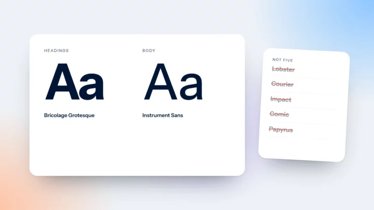
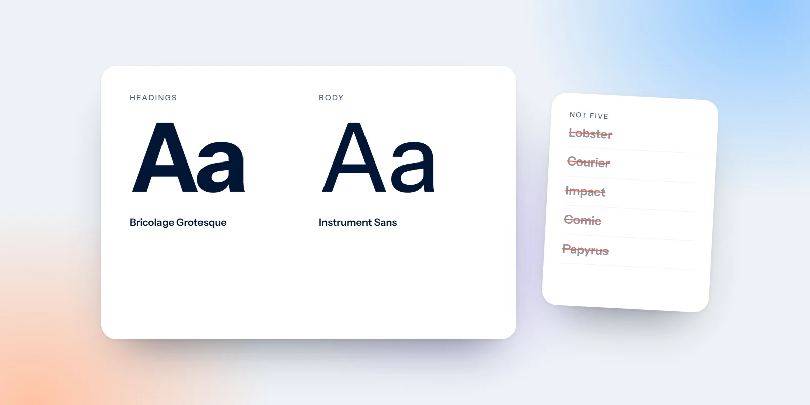
A bold display face with a quiet text face: A heavy or distinctive display face for headlines, with a neutral text face underneath. Our own studio uses Bricolage Grotesque for headlines and Instrument Sans for everything else.
Two serifs, different jobs: This can work when the contrast comes from weight and size. Delta Luxury Transport uses Playfair Display for headlines and EB Garamond for text, which suits a premium chauffeur service.
Families that are designed to pair: Some type families come in matching serif and sans versions. In our invented bakery brand review, DM Serif Display and DM Sans give a warm, simple pair that is easy to live with.
When a third typeface earns its place
A third font is worth adding only when you can name its job in a few words. Numbers on a menu or price list. Labels and small captions. Technical details, such as product codes. We use IBM Plex Mono for the small uppercase labels on our own materials, and nowhere else. If you cannot name the job, you do not need the font.
The test for a third typeface: can you name its job in five words? If not, leave it out.
How to test fonts for your brand at real sizes
Fonts often look lovely in a specimen and disappointing in use. Before you commit, test them in the places they will actually live.
Set a real page: Write a headline, two paragraphs, a button and a price, using your actual content. Do not judge a font on a single word.
Read it on your phone: Open it on a small screen in daylight. Text faces that look elegant on a large monitor can feel thin and tiring on a phone.
Print it: Print a page and a business card. Some fonts lose detail at small print sizes.
Check the licence: Many fonts on Google Fonts are free to use commercially under open licences, but others need a paid licence for websites, apps or print. Check before you build anything.
Plan your fallbacks: Custom fonts do not show in every email app, so pick a similar system font as a fallback. Our guide to fonts in email design explains which ones are safe.
Count your fonts today
Here is a five-minute exercise. Open your homepage, your last flyer, your email signature and your latest Instagram post. Write down every typeface you can spot. If there are more than two, pick the strongest headline face and the most readable text face from the list, and plan to replace the rest. Start with the website, because it is the piece most customers see first, then update templates so new material uses the right pair by default.
Typography is one of the quickest ways to make a brand feel more considered, and it is a core part of every brand identity we design: two typefaces, a clear size scale and rules your team can follow. If you would like a second opinion on what you have now, we can help.
More than two fonts on your site? Get a free brand review and we will show you which to keep.

