 October 16, 2026
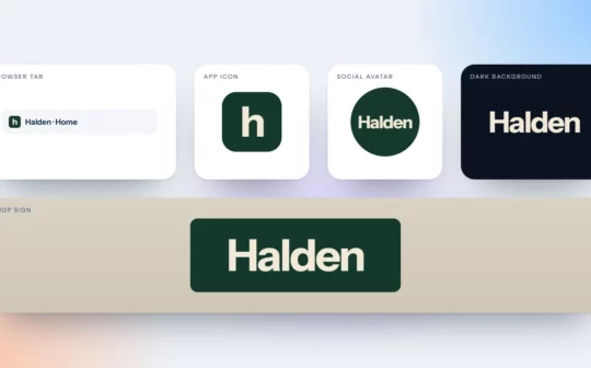
Test Your Logo in Five Places Before You Approve It
A logo that looks perfect on a white screen can fail in an avatar, on a photo or at 16 pixels. Five quick tests to run before you approve it.
 October 16, 2026
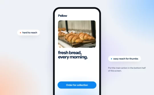
Design for Thumbs: Mobile Website Tips for Small Businesses
Most people browse with one hand. Five practical mobile website tips, and a quick test: can you book, buy or call with one hand, standing on a bus?
 October 16, 2026
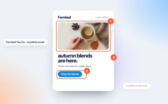
Newsletter Review Example: A Tea Shop’s Monthly Email
We mark up an invented tea shop’s newsletter: an offer hidden in a photo, four paragraphs before anything to click, and a lonely “click here”. Then we fix it.
 October 16, 2026
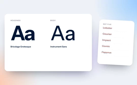
Two Typefaces Are Enough: Choosing Fonts for Your Brand
Most brands need two typefaces: one with personality for headlines, one built to be read. Here is how to choose and pair them.
 October 16, 2026
Light Grey Text Is Costing You: A Plain Guide to Colour Contrast
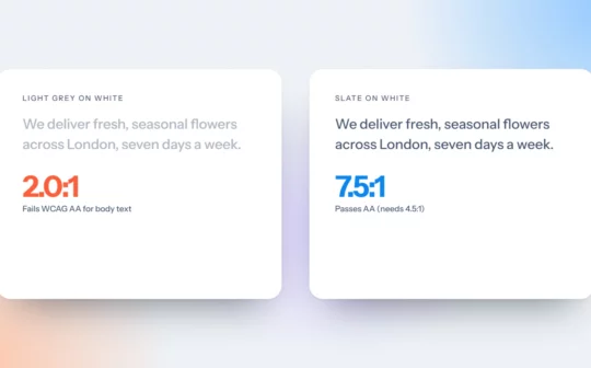
Light grey text looks elegant in a mockup and disappears on a phone in sunlight. The contrast numbers that matter, and three quick fixes.
 October 16, 2026
Design Emails That Still Work With Images Off
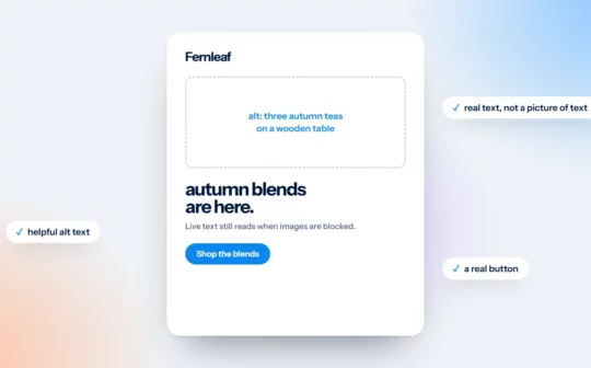
An email made of one big image becomes a blank box when images don’t load. Four design habits that keep your message readable either way.
 October 16, 2026
The 60-30-10 Colour Rule for Brands and Websites
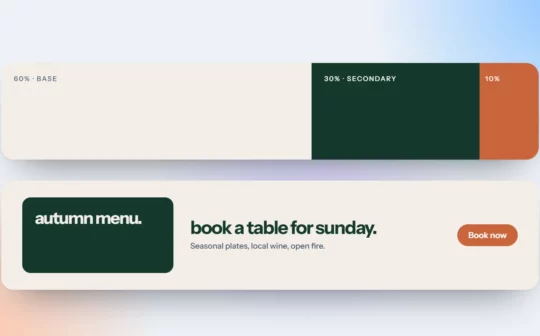
Sixty per cent dominant, thirty secondary, ten accent. A simple colour rule that keeps brands and websites calm, clear and easy to act on.
 October 16, 2026
Say What Only You Can Say: Writing Website Copy That Stands Out
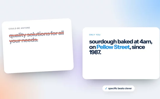
“Quality service you can trust” could belong to anyone. A simple recipe for taglines and website copy that only your business could say.
 October 16, 2026
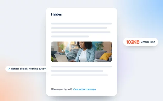
Why Gmail Clips Your Emails, and How Design Can Avoid It
Gmail hides the end of emails over about 102KB. What gets lost, why it matters, and the design decisions that keep your campaigns light.
 October 16, 2026
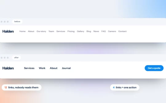
Your Menu Is Not a Sitemap: Simple Website Navigation
Your menu doesn’t need to list every page. Four rules for simple website navigation, with a before and after you can copy.